.webp)

Parth Parmar
Webflow
March 23, 2026

Insights, ideas, and expert perspectives shared by the author on design, development, and digital growth.
A Webflow site may look visually perfect during the design phase, but responsiveness is where real technical quality is tested. When layouts are not built with scalability in mind, they break across devices, causing misalignment, overflow issues, and poor usability. This is not a limitation of Webflow, but a result of how the site is structured and styled.
Responsive design in Webflow is deeply tied to CSS behavior, layout systems, and spacing logic. It is about creating a flexible system rather than fixing individual elements at each breakpoint. When done correctly, your site becomes easier to maintain, faster to load, and consistent across all screen sizes.
This guide explains the technical approach to making a Webflow site responsive using a combination of structured steps and practical implementation strategies.
Webflow follows a desktop first approach where styles are applied at the base level and cascade down to smaller screens. This means your desktop design directly influences tablet and mobile layouts.
From a technical standpoint, this behavior is powered by max width media queries. If not managed properly, it can lead to inconsistent layouts and redundant styling.
A better approach is to define strong global styles first and then make minimal, targeted adjustments for smaller screens. This keeps your CSS clean and predictable.
Every responsive layout starts with a well organized DOM. In Webflow, the way you nest elements directly impacts how layouts behave across breakpoints.
Instead of randomly placing elements, follow a structured hierarchy. A typical scalable structure includes sections for grouping, containers for alignment, wrappers for layout control, and content elements inside.
Keeping your structure clean reduces the need for excessive styling and prevents layout issues later.
Fixed units are one of the biggest reasons layouts break on smaller screens. A responsive layout must be flexible by default.
Instead of defining everything in pixels, use relative units that adapt based on screen size.
Avoid setting fixed heights for dynamic content. This often leads to overflow when content grows or screen size changes.
A flexible layout reduces dependency on breakpoint specific fixes.
A technically sound responsive layout often uses a combination of width and max width.
This approach ensures that elements remain fluid but do not stretch too much on larger screens.
This pattern is especially useful for containers, images, and text sections. It maintains readability while allowing flexibility.
Flexbox is one of the most efficient tools for handling responsiveness in Webflow. It allows layouts to adapt dynamically without requiring multiple adjustments.
For example, a row based layout on desktop can be converted into a column layout on mobile with a single change.
Flexbox reduces complexity and allows layouts to respond naturally to screen changes.
While Flexbox works well for linear layouts, Grid is better for more structured designs.
Grid allows you to define rows and columns, making it easier to manage complex sections like product grids or feature blocks.
This ensures that content remains readable and properly spaced across all devices.
Grid also provides better control over placement, which is useful for maintaining visual consistency.
Spacing is often handled inconsistently, which leads to design issues across breakpoints. Instead of random spacing, use a defined system.
Spacing should scale logically as screen size changes. Larger screens can handle more spacing, while smaller screens require tighter layouts.
A structured spacing system improves both responsiveness and visual balance.
Overflow is a common problem in responsive design. It happens when elements exceed their container size.
This is usually caused by fixed dimensions, long text, or improper layout settings.
Testing edge cases such as long headings or dynamic content is important to ensure stability.
Typography must adapt to different screen sizes without losing readability. Large text that works on desktop can become overwhelming on mobile.
Instead of using fixed font sizes, use scalable units and adjust them where needed.
Typography should remain clear and accessible across all devices.
Images must scale correctly while maintaining performance. Poorly handled images can break layouts or slow down your site.
Always ensure that images fit within their containers and adjust based on screen size.
Webflow helps by generating responsive image sizes, but proper implementation is still required.
Navigation is a critical part of responsive design. A complex desktop menu often does not translate well to mobile.
You need to simplify navigation while maintaining usability.
Navigation should remain intuitive and accessible regardless of device.
Webflow allows you to control element visibility at different breakpoints. This is useful for optimizing layouts for specific devices.
For example, large visuals that work on desktop may not be suitable for mobile.
Use visibility settings carefully to maintain consistency and performance.
Responsiveness is not just about layout. Performance plays an equally important role.
A site that adapts well but loads slowly still delivers a poor experience.
Performance optimization ensures your responsive design works efficiently across all devices.
Testing is essential for identifying issues that may not be visible during design.
You should not rely only on Webflow preview mode. Real device testing provides more accurate results.
Continuous testing helps maintain consistency and prevents unexpected issues after launch.
Many responsiveness issues come from avoidable technical mistakes. These mistakes often increase complexity and reduce scalability.
Avoiding these mistakes keeps your design clean and maintainable.
Once you are comfortable with the basics, you can use advanced techniques to refine your layouts further.
These techniques provide more flexibility but should be used carefully to avoid unnecessary complexity.
Building a technically sound responsive site requires experience and attention to detail. Many businesses prefer working with a webflow development agency to ensure their website is optimized for performance and scalability.
Professional webflow development focuses on clean structure, efficient styling, and long term maintainability, which are essential for high quality responsive design.
Making a Webflow site responsive is a technical process that requires a strong foundation in layout systems, CSS behavior, and performance optimization. It is not about adjusting individual elements but about building a flexible system that adapts naturally across devices.
By combining structured layouts, flexible units, proper use of Flexbox and Grid, and consistent testing, you can create a responsive site that performs reliably on all screen sizes.
As devices and user expectations continue to evolve, responsive design will remain a critical factor in website success. A well implemented approach ensures your Webflow site stays scalable, efficient, and user friendly over time.
In today's hyper-competitive digital landscape where attention spans are shorter than ever, having a stunning portfolio website has become absolutely critical for designers, developers, freelancers, and creative professionals who want to stand out from the crowd. Your portfolio is invariably the first impression that potential clients, employers, or collaborators will have of your work, and it needs to capture attention, communicate value, and inspire action. Whether you're a photographer showcasing stunning imagery, a graphic designer displaying brand identities, a web developer highlighting technical expertise, a UX designer demonstrating user-centered thinking, or a creative entrepreneur building your personal brand, your portfolio website serves as far more than a simple resume. It functions as your most powerful marketing tool, your sales pitch on autopilot, your credibility builder, and your opportunity to differentiate yourself in a crowded marketplace. Statistics show that over 75% of people judge a business's credibility based on its website design, making your portfolio not just important but essential for your professional success.
If you're looking to build a professional portfolio website without touching code, Webflow has emerged as one of the most powerful and flexible solutions available today. Unlike traditional website builders that limit your design possibilities, Webflow gives you the creative freedom to craft a unique online presence that truly represents your work and brand identity. Many businesses turn to a Webflow development agency when they want professional results, but with this guide, you'll learn that creating an impressive portfolio is entirely within your reach.
The beautiful thing about using Webflow is that it combines the simplicity of a visual builder with the power of custom code if you need it. You have complete control over every pixel, every animation, and every interaction on your site. In this comprehensive guide, we'll walk you through each step of building a portfolio website that not only showcases your best work but also converts visitors into clients.
Before diving into the technical steps, it's worth understanding why Webflow has become the go-to platform for portfolio creation among creative professionals worldwide. The choice of platform fundamentally shapes what's possible for your portfolio, so let's explore why Webflow stands apart from alternatives.
Unlike traditional website builders like Wix or Squarespace that constrain your creativity with pre-built templates and rigid design systems, Webflow offers unparalleled design freedom that rivals custom-coded websites. You're not forced to work within predetermined layouts or limited customization options. Instead, you work with a comprehensive design canvas where you can implement virtually any design you can imagine. You have pixel-perfect control over every element, color, spacing, and interaction. This level of freedom is what attracts designers who refuse to compromise their vision for the sake of convenience.
Another compelling reason to choose Webflow is its integrated hosting and SSL certificate infrastructure. Your website is automatically hosted on Webflow's secure, globally distributed servers, and you don't need to manage separate hosting accounts, domain registrars, DNS settings, or deal with complex technical infrastructure. SSL certificates for HTTPS encryption are included automatically, providing your visitors with secure connections. This makes Webflow ideal for creatives who want to focus entirely on design and user experience rather than wrestling with backend management, server configurations, or technical headaches.
Furthermore, Webflow is exceptionally SEO-friendly right out of the box. It generates clean, semantic HTML code that search engines love. The platform allows you to customize critical SEO elements including meta tags, meta descriptions, heading hierarchy, alt text for images, and URL slugs. You can set canonical tags, control indexing with robots.txt, and manage your site structure in ways that directly impact search visibility. For those working with a professional Webflow development agency, these technical advantages translate directly to better search rankings and more organic traffic to your portfolio. Search engines reward well-structured, fast-loading sites, and Webflow excels in both areas.
The platform also offers powerful dynamic CMS capabilities, which fundamentally changes how you manage your portfolio over time. As your portfolio grows and you complete new projects, you can easily add new work samples without touching code or redesigning your site structure. You can create dynamic collections for your work samples, establish reusable components, and set up automatic templating that applies consistent formatting to all your projects. This means updating your portfolio becomes as simple as filling out a form rather than a technical redesign project. For freelancers and agencies constantly adding new work, this scalability is invaluable.
Additionally, Webflow's visual development environment means you don't need to write code unless you want to. You have the option to leverage custom code for advanced functionality, but everything you need to create a world-class portfolio is available through the visual interface. This bridges the gap between designer and developer, allowing you to implement complex interactions and animations that would otherwise require hiring a developer.
Your journey to a professional portfolio begins with creating a Webflow account. Navigate to webflow.com and sign up for a free account. Upon registration, you'll have immediate access to the Webflow Designer, which is the powerful visual development environment where you'll build your entire portfolio. Free accounts provide robust functionality to build a complete, fully-featured portfolio with all the design capabilities you'll need. However, to publish your site to a custom domain and access more advanced features like team collaboration, you'll eventually want to upgrade to a paid plan.
Once you've created your account and verified your email, click on the "Create New" button to start a new project. At this point, Webflow presents you with two primary starting points. You can begin from a completely blank canvas, which gives you maximum creative control and ensures every design decision is intentional. Alternatively, you can choose from Webflow's extensive template gallery, which provides professionally designed starting points. For maximum creativity and a unique portfolio, we recommend starting with a blank project. This approach ensures your portfolio is distinctive and truly represents your personal brand. However, if you prefer a head start or want to accelerate your timeline, exploring their template library can provide excellent design inspiration and save you significant time on initial structure and layout decisions.
Before starting to design, invest time in planning your site's architecture and navigation. Think through the pages you'll need. Most portfolio sites include a home or landing page that introduces visitors to your work, a portfolio or work samples section that showcases your best projects, an about page that builds trust and credibility, a services or expertise page that outlines what you offer, and a contact page that makes it easy for potential clients to reach out. You might also include a blog section if you plan to share insights and build thought leadership. Sketch out this structure on paper or in a digital wireframing tool before you open Webflow's designer. This foundational thinking ensures your information architecture supports your business goals and user experience objectives.
When creating your new project, Webflow will ask you to name it and select a domain plan. Choose a project name that's meaningful to you; you can always change it later. If you already own a domain name, you can use Webflow's professional plans which allow you to connect custom domains. If you don't have a domain yet, you can purchase one directly through Webflow or use their temporary domain while you build your site. Understanding domain strategy early helps you plan your site structure and ensures consistency in how you present your professional brand online. This foundational thinking is something every professional using Webflow development services considers at the project's beginning.
A well-organized navigation system is absolutely crucial for keeping visitors engaged with your portfolio and guiding them toward your conversion goals. Navigation is typically the first interactive element users encounter, and it shapes how visitors understand and navigate through your content. In Webflow, start by accessing the Navigator panel on the left side of your designer interface. This powerful panel shows your entire site structure in a clear hierarchical view, making it easy to understand and reorganize your page elements.
Begin by creating major structural sections for your page. You'll typically want sections for your main header, a hero section that greets visitors, your portfolio showcase section, an about or credentials section, testimonials or social proof, and a footer with additional navigation and contact information. Give each section clear class names in Webflow so you can easily identify and style them later. Using semantic naming conventions like "hero-section," "portfolio-grid," and "footer-main" makes your structure more understandable and makes future edits simpler.
For your header area, this is where your primary navigation lives, so make it count and ensure it's strategically designed. Add a header element and place a navigation component inside it. Your navigation menu should include links to your main pages and a prominently displayed call-to-action button, typically something like "Get in Touch," "Hire Me," or "Start Your Project." The CTA button should use a contrasting color that draws the eye and invites interaction.
Keep your navigation simple and uncluttered; five to seven main links are usually ideal. Too many navigation options overwhelm visitors and dilute the focus of your site. If you have numerous pages or portfolio categories, consider using dropdown menus to organize secondary pages. On mobile devices, navigation should collapse into a hamburger menu (three horizontal lines) that expands when tapped. Webflow makes this incredibly easy to implement using their interaction and animation features without requiring any coding.
The hero section is the landing area that greets visitors immediately when they arrive at your portfolio. This is where you set the tone for your entire brand and make a critical first impression. Within seconds, visitors should understand who you are and why they should explore further. Your hero section should include a compelling, benefit-focused headline that immediately communicates your value proposition. Rather than simply stating "I'm a web designer," try something more compelling like "I create digital experiences that drive measurable business results."
Include a brief, punchy subheading that expands on your main headline and provides context about your work or approach. Add a hero image, video background, or animated visual that immediately communicates your style and expertise. This could be a striking photograph of your work, an animated demonstration of your capabilities, or a beautifully designed graphic that represents your brand. Use colors, typography, and imagery that are cohesive and reinforce your brand identity.
Most importantly, consider the user experience flow through your entire site. After the hero section captures attention, guide visitors toward your work samples where they can see tangible evidence of your capabilities. From there, you might include a brief about section that builds trust and credibility through your story and credentials, followed by clear call-to-action buttons encouraging them to contact you. This journey should feel natural and logical, with each section building on the previous one to create a compelling narrative about your professional value.
This section is where your work takes center stage and becomes the focal point of your portfolio. Your portfolio showcase is the heart of your site because it's where you demonstrate your capabilities, expertise, and creative vision to potential clients and collaborators. This is the section that ultimately determines whether visitors will reach out to work with you or move on to a competitor's site. Therefore, it deserves meticulous attention and strategic thinking about presentation.
In Webflow, create a new dedicated section specifically for showcasing your best work. Begin by determining how many projects you want to showcase; typically between six and twelve of your absolute best projects works well. Quality dramatically outweighs quantity. One stunning project that demonstrates exceptional work and clear results will convert more prospects than twenty mediocre projects. Select work that showcases variety in your skills while remaining cohesive within your overall style and expertise.
Use Webflow's sophisticated grid system to create a responsive layout that adapts beautifully to different screen sizes and devices. A common approach for desktop viewing is a two-column or three-column grid layout that provides visual balance and allows multiple projects to be visible without overwhelming the viewer. This same layout should collapse intelligently to a single column on mobile devices to ensure excellent readability and usability on smaller screens. Webflow's responsive design capabilities make this adaptation seamless without requiring any coding knowledge.
Make sure each project card includes several key elements. Start with an eye-catching thumbnail image that immediately captures attention and gives an accurate preview of the project. The project title should be clear and descriptive, followed by a brief description of what you created and your specific role in it. Include information about the project type, tools used, timeline, and if appropriate, results achieved. This information provides context and helps visitors understand the scope and sophistication of your work.
One of Webflow's most powerful features is its ability to create sophisticated interactive elements without requiring any coding. Add hover effects to your project cards so that when visitors move their mouse over them, the cards respond with smooth, delightful animations. These might include a subtle scale increase that makes the card appear to lift off the page, a color overlay that reveals additional information, or a fade-in effect that reveals a text description or call-to-action. These micro-interactions add tremendous polish and engagement to your portfolio, making the experience feel responsive and crafted rather than static.
For each project thumbnail, create a detailed project page that visitors can navigate to by clicking the project card. Include rich project context that explains the challenge you were solving, your creative approach, any constraints you worked within, and the results you achieved. This storytelling approach transforms your portfolio from a simple image gallery into a compelling narrative that demonstrates your problem-solving thinking and expertise. Use high-quality images of your work, generous white space for visual breathing room, and consider including before-and-after comparisons when relevant. If you designed a website, include screenshots of different pages. If you created branding, show the logo in various applications. If you designed a campaign, show different marketing materials and results.
Your about section is where you build genuine trust and establish a meaningful personal connection with visitors. Many portfolio sites unfortunately neglect this section, treating it as an afterthought, but it's actually crucial for converting visitors into actual clients. People do business with people they like and trust, so take significant time to craft a compelling, authentic about section that communicates your values, experience, and unique perspective.
In this vital section, share your professional story in a way that feels genuine and relatable. Explain how you got into your field and what sparked your passion for your craft. Share what drives your work and what you're genuinely excited about. Communicate what makes your approach to your work unique and different from competitors. Do you have a particular philosophy or methodology? Do you focus on specific types of clients or projects? This is your opportunity to create a personal connection that differentiates you from other professionals.
Include a professional headshot or portrait that presents you warmly and authentically. The photo should feel genuine rather than overly formal or stuffy. A professional photographer is worth the investment for a quality headshot. The tone of your about section should be personable but professional. Avoid being overly salesy or using marketing clichés. Instead, focus on your genuine experience, your core values, and your authentic commitment to your craft. People can sense authenticity, and it dramatically increases trust and connection.
Consider adding a skills section that lists your main competencies, tools you work with, and areas of expertise. In Webflow, you can organize this information as a simple list, as icons with labels, or even as interactive elements that reveal more detail when clicked. Keep this section scannable and easy to digest so that visitors can quickly understand your capabilities at a glance. Use clear language and avoid jargon unless your target clients use that terminology in their industry.
You might also include some credibility statistics and achievements that provide social proof: years of professional experience, number of clients you've served, awards you've won, major projects or companies you've worked with, or quantifiable results you've achieved for clients. These social proof elements help establish credibility quickly and provide tangible evidence of your track record. Ensure these statistics are truthful and relevant to your target audience. For example, if you're a designer, sharing the number of successful design projects is meaningful. If you're a developer, sharing years of coding experience and clients served is relevant.
Consider adding client testimonials in your about section if you have them. These third-party endorsements carry significant weight because they come from people who have actually worked with you and experienced your value. If you don't have testimonials yet, reach out to past clients and ask them to share brief comments about working with you. A few genuine, specific testimonials are far more valuable than no testimonials. Format testimonials with the client's name, title or company, and a brief quote about their experience working with you.
Finally, include a clear call-to-action in your about section that encourages interested visitors to take the next step, typically reaching out to discuss a potential project. Something like "Let's work together" or "Ready to create something amazing?" followed by a button that links to your contact form keeps the momentum going and gives interested prospects an obvious next step.
Your portfolio needs a clear, frictionless path for potential clients to reach out and express interest in working with you. Create a dedicated contact section with a thoughtfully designed form that captures only the essential information needed to start a conversation. In Webflow, adding a form is straightforward using the form element in the elements panel, and you have complete control over how it looks and functions.
Your contact form should request only the information you genuinely need to follow up. Typically this means the visitor's name, email address, phone number (optional), company or business they work for, and a message field where they can describe their project or inquiry. Asking for too much information in a contact form dramatically increases drop-off rates and decreases conversions. You can gather additional details like budget, timeline, and specific project requirements in subsequent conversations once you've established initial interest.
Make your form fields clearly labeled with descriptive labels that are easy to understand. Include helpful placeholder text that guides users on what to enter. For example, instead of just "Message," your placeholder might say "Tell me about your project or question." Form fields should be large enough to easily tap on mobile devices and should provide clear visual feedback when users interact with them. Use contrasting colors for your submit button so it stands out and clearly invites action.
Webflow integrates seamlessly with email services and automation platforms like Zapier and Make (formerly Integromat). This integration allows you to automatically send form submissions to your email inbox or CRM system, ensuring you never miss a potential opportunity. You can set up automated email responses so that when someone submits your form, they receive immediate confirmation that you've received their message and an expected timeline for your response. This professional touch significantly improves the user experience and demonstrates that you take inquiries seriously.
Beyond the single contact form, strategically place complementary call-to-action buttons throughout your site to guide visitors toward conversion at every step of their journey. After your hero section, include a CTA button inviting visitors to explore your portfolio. After your portfolio showcase, include another CTA encouraging them to learn more about your process or services. After your about section, invite them to discuss their project. Every major section should naturally guide visitors toward the next step: viewing your best work, learning about your expertise, understanding your approach, or getting in touch.
These CTAs should use compelling, action-oriented language that creates urgency and clarity. Rather than generic buttons that say "Submit," use specific language like "View My Work," "See How I Can Help," "Start Your Project," "Get a Free Consultation," or "Let's Create Something Amazing." Button color should contrast sharply with your background so they can't be missed. Consider adding subtle hover animations that make buttons respond when users move their mouse over them, creating a sense that the interface is responsive and interactive.
The strategic placement and consistent presence of CTAs throughout your site creates multiple conversion opportunities. Not every visitor will reach your contact page, but if you place CTAs strategically throughout your site, you increase the likelihood that interested prospects will take action before they leave.
In today's mobile-first world where more than half of all internet traffic originates from mobile devices and tablets, ensuring your portfolio looks absolutely stunning on all screen sizes is non-negotiable for success. A portfolio that looks beautiful on desktop but is difficult to navigate on mobile devices will lose potential clients instantly. Google also prioritizes mobile-friendly websites in search rankings, making mobile optimization critical for both user experience and search visibility. Webflow makes responsive design significantly easier than most platforms by allowing you to design specifically for different breakpoints and preview changes in real-time.
As you build your portfolio in Webflow, establish a consistent habit of previewing how it looks on different devices. View your design on desktop, tablet, and mobile screens regularly throughout the design process. Webflow's responsive design tools let you adjust layouts, typography, spacing, and element visibility for each specific screen size. For example, what works beautifully as a three-column grid on desktop might need to collapse to a two-column layout on tablet and a single column on mobile devices to maintain readability and ensure the portfolio doesn't feel cramped.
Pay special attention to your navigation menu on mobile devices. Your full desktop navigation with multiple links should collapse into a clean hamburger menu icon that expands when tapped. This keeps your header clean and uncluttered on small screens. Your hero section text should remain readable and impactful on mobile without appearing tiny or overwhelming. Test your image sizing to ensure that portfolio images scale appropriately and remain visually striking across all devices without becoming distorted or losing clarity.
Test your contact form meticulously on mobile devices to ensure it's genuinely easy and enjoyable to fill out on a small screen. Form fields should be large enough to easily tap with a finger without accidentally hitting the wrong field. Labels should be positioned clearly above fields so users understand what information is being requested. Your submit button should be prominently placed and large enough to tap comfortably. On mobile, form fields naturally stack vertically, which is fine as long as the form doesn't become excessively long.
Check that your navigation menu on mobile is intuitive and easy to use. Opening the mobile menu should be obvious, and closing it should be equally obvious. All links should be easily tappable without requiring perfect precision. Your footer should display properly on mobile with all contact information and links remaining accessible. Verify that images scale appropriately without becoming distorted, blurry, or oversized relative to the screen. These seemingly small details matter immensely because a frustrated mobile user encountering usability issues is unlikely to continue navigating through your site or reach out to you.
Use Webflow's device preview mode to test your responsive design on actual devices when possible. What looks acceptable in the preview window might feel cramped or uncomfortable on an actual phone. Testing on real devices reveals micro-interactions, touch targets, and layout issues that theoretical previews might miss. The investment in thorough mobile testing directly translates to better user experience and higher conversion rates.
This is where your portfolio elevates from good to genuinely great and memorable. Webflow's robust interaction and animation capabilities allow you to create a dynamic, engaging experience that feels modern and polished without requiring any coding knowledge. You can create sophisticated animations that trigger on page load, respond to hover interactions, or activate as users scroll through your site, creating a sense of motion and life that static websites simply cannot match.
Consider adding a subtle fade-in effect as your portfolio project cards come into view while visitors scroll down the page. This draws attention to your work as it naturally enters the viewport and creates a sense of reveal and discovery. Rather than showing all projects at once, this progressive reveal makes the experience feel more dynamic and engaging. Add hover animations to your project cards so that when visitors move their mouse over them, the cards respond with smooth transitions like a slight upward movement, a shadow increase that appears to lift the card, a color overlay that highlights the card, or a scale increase that makes the card slightly larger. These micro-interactions feel responsive and professional, signaling to users that the interface is interactive and inviting.
More ambitious and impactful animation effects might include parallax scrolling, where background images move at different speeds than foreground content, creating a striking sense of depth and visual interest. Animated counters that increment upward to show statistics or client numbers can add visual dynamism and movement to your about section, making statistics more memorable and engaging. Hover effects on buttons that cause them to slightly enlarge, change color, or display additional information create a responsive feel that encourages interaction.
You might also implement scroll-triggered animations that activate specific effects only when elements come into view. For example, you could have statistics numbers count up from zero when the about section enters the viewport. You could have text elements slide in from the left or right as the user scrolls. You could create animations that reveal additional project details or images on hover. These effects create a sense that your portfolio has been carefully crafted with attention to detail and user experience.
The critical principle with animations is restraint and purposefulness. Animations should enhance the user experience and make your portfolio feel polished and responsive, but they should not distract from your actual work or slow down site performance. Every animation should have a clear purpose and should load quickly without causing lag or reducing site speed. Avoid animations that feel gratuitous, repetitive, or annoying. The goal is to impress visitors with subtle polish and attention to detail, not to overwhelm them with constant motion. Test animation performance across different devices and internet speeds to ensure that users on slower connections or older devices still experience a smooth, fast-loading portfolio.
Pay special attention to animation timing and easing. Animations should feel natural and smooth rather than jerky or too fast. Webflow provides pre-set easing options that make animations feel more organic and polished. A well-executed animation creates an almost imperceptible sense of delight; users feel that something is responsive and satisfying without being consciously aware of the animation itself.
Before publishing your portfolio live to the world, invest significant time in SEO optimization to ensure search engines can properly understand and rank your site. Webflow makes technical SEO accessible even to non-technical users through its intuitive settings and built-in SEO tools. Start by optimizing your page titles and meta descriptions, which are critical ranking factors and the text that appears in search engine results. Each page on your portfolio should have a unique, descriptive title tag between 50 and 60 characters that clearly describes the page content and includes relevant keywords naturally. For example, rather than "Portfolio," your homepage title might be "Web Designer Portfolio | Award-Winning Digital Design Studio."
Your meta descriptions should be approximately 155-160 characters and accurately summarize the page content while including keywords naturally. These descriptions appear below your page title in search results and directly influence click-through rates. A well-written meta description that includes relevant keywords and clearly communicates value can significantly increase traffic to your site.
For all your portfolio project pages, write descriptive, keyword-rich alt text for every image. This serves dual purposes: it helps search engines understand what your images contain, improving your SEO, and it significantly improves accessibility for users with visual impairments using screen readers. Rather than generic alt text like "image" or "project," write descriptive text like "ecommerce website redesign for luxury fashion brand with custom shopping experience."
Structure your content with proper heading hierarchy throughout your entire site. Use a single H1 heading for your main page title or primary headline, use H2 tags for major section headings, and use H3 tags for subsections within those sections. This clear hierarchy helps search engines understand your content structure and improves both SEO and accessibility. Include relevant keywords naturally in your page content, headings, descriptions, and meta information without keyword stuffing, which search engines penalize.
Create descriptive URL slugs that reflect your actual page content rather than using generic or cryptic URLs. For example, a project page about a website redesign you did should have a URL like "webflow-ecommerce-redesign" rather than "project-1" or "page-42." Descriptive URLs are more shareable, more memorable, and slightly improve SEO performance.
When you're ready to publish your portfolio to the world, connect a professional custom domain to give your site a professional appearance and build your personal brand. In Webflow's hosting settings, you can either connect a domain you already own through domain registrars, or purchase a domain directly through Webflow's domain marketplace. Your domain choice matters for branding and memory; ideally it should be your name or closely related to your professional brand.
Before publishing, run your site through Webflow's built-in performance tools and Google's PageSpeed Insights to identify any optimization opportunities. Ensure your images are properly optimized for web, your CSS and JavaScript are minified, and your site loads quickly across all connection speeds. Page load speed is a ranking factor for search engines and directly impacts user experience.
Once your portfolio is live, set up Google Search Console and Google Analytics to monitor your site's performance. Search Console shows you how search engines see your site, which keywords drive traffic, and identifies any technical issues. Analytics shows you how visitors interact with your site, which pages they visit, how long they stay, and whether they take desired actions like submitting contact forms. Use these insights to continuously refine and improve your portfolio based on real visitor behavior.
Absolutely not. One of Webflow's greatest strengths is its visual builder interface that allows anyone to create professional, fully-featured websites without writing a single line of code. The drag-and-drop interface, combined with intuitive settings panels, makes web design accessible to designers, photographers, and creatives who have no coding background. While Webflow does offer the option to add custom code for advanced functionality, every feature you need to create a world-class portfolio is available through the visual interface. That said, basic understanding of web design concepts like typography, color theory, spacing, and layout helps, but this is knowledge about design principles, not coding.
Webflow offers several pricing tiers. Free accounts allow you to build complete portfolios but only publish them to a Webflow subdomain rather than a custom domain. Personal Pro plans start around $12 per month and include hosting and SSL certificate, allowing you to connect a custom domain. For most portfolio creators, a Personal Pro plan is sufficient. You'll also need to purchase a domain name if you don't already own one, which typically costs between $10 and $15 annually, though premium domains can cost more. The total cost for a professional portfolio in Webflow is typically $150 to $250 annually, which is significantly less than hiring a web developer to build a custom website.
Yes, absolutely. Webflow allows you to connect any domain you own, regardless of where you purchased it. If you already own a domain through GoDaddy, Namecheap, or another registrar, you can connect it to your Webflow site by updating DNS records. Alternatively, you can purchase a domain directly through Webflow's domain marketplace during the publishing process. Webflow handles all hosting and SSL certificates automatically, so you don't need to manage separate hosting accounts or deal with technical configurations.
Yes, Webflow is exceptionally SEO-friendly. The platform generates clean, semantic HTML code that search engines love. Webflow includes built-in tools for customizing meta tags, meta descriptions, heading hierarchy, alt text for images, and URL slugs. The platform is fast-loading, which improves search rankings. You have granular control over SEO elements that directly impact search visibility. However, SEO success ultimately depends on your content quality, keyword research, and ongoing promotion efforts. Webflow simply provides excellent technical foundation and tools to implement best practices.
Webflow's dynamic CMS capabilities make adding a blog straightforward. Create a new collection called "Blog Posts" and add fields for title, date, featured image, and post content. Create a blog listing page that displays summaries of your posts, then create a blog post template page that displays individual articles. Webflow's CMS automatically handles pagination, filtering, and organization. As you add new blog posts, they automatically populate across your site according to your templates. This scalability makes maintaining a blog alongside your portfolio easy.
Yes, one of Webflow's main advantages is that you can update your portfolio independently. If you set up your portfolio with Webflow's CMS collections properly, adding new portfolio projects is as simple as filling out a form with your project details, images, and description. Webflow applies your existing template design automatically. You don't need to redesign or rebuild anything; you simply add new content. This makes Webflow far more cost-effective than custom-coded sites that typically require developer assistance for any updates.
After publishing your Webflow portfolio, submit your site to Google Search Console by visiting google.com/webmasters. Search Console tells Google about your site and allows you to monitor search performance. Create a sitemap in Webflow (which is automatic) to help Google discover all your pages. Ensure your pages have descriptive titles and meta descriptions with relevant keywords. Build quality content and gather backlinks from reputable sources, which improves your authority. Finally, update your portfolio regularly with fresh content and projects. SEO takes time, typically several months to see significant results, but patience combined with quality content and proper optimization yields excellent returns.
Yes. Webflow integrates with platforms like Zapier and Make that act as bridges to hundreds of other services. You can set up automation so that form submissions automatically send to your email, your CRM system, your email marketing platform, or virtually any other service. This ensures you never miss inquiries and can automatically begin nurturing relationships with interested prospects. Direct integrations with services like HubSpot and Mailchimp are also available on some Webflow plans.
Building your portfolio yourself in Webflow saves money and ensures complete control over your design and branding. However, hiring a professional Webflow development agency can accelerate the process, result in more sophisticated design and interactions, and ensure best practices are followed. Agencies bring experience, design expertise, and efficiency. The choice depends on your budget, timeline, design confidence, and complexity of your vision. For most creative professionals, building your own portfolio in Webflow is entirely feasible and cost-effective.
You should update your portfolio whenever you complete significant new projects that demonstrate your current capabilities and style. Aim to add new work at least every few months, or whenever you have 3 to 5 quality projects to showcase. Beyond adding new projects, periodically refresh your about section, update testimonials, and review your overall design to ensure it remains current and reflects your evolving brand. A portfolio that hasn't been updated in years signals that you may not be actively working, so consistent updates demonstrate active engagement in your field.
Building a portfolio website in Webflow empowers you to create a professional online presence that truly represents your work and capabilities. From the initial setup through to publishing and optimization, each step we've covered contributes to a portfolio that impresses visitors and converts them into clients.
Whether you're working independently or considering a Webflow development agency for more complex projects, understanding these fundamentals ensures you can evaluate your options and appreciate the strategic thinking behind great portfolio design. The platform's combination of design freedom, responsive capabilities, and built-in hosting makes it an excellent choice for creatives at any skill level.
Remember that your portfolio is not a static asset. It's a living representation of your professional growth. As you complete new projects, update your portfolio with fresh work samples. As your skills evolve, refine your about section to reflect your current expertise. Continue testing and refining based on visitor behavior and feedback.
The competitive advantage goes to those who invest in their online presence. Your portfolio website is often your first and best sales tool. By following this comprehensive guide and leveraging Webflow's powerful features, you're positioning yourself for success and opening doors to exciting opportunities. Start building today, and watch as your portfolio becomes the gateway to your best work and your most rewarding projects.
If you're working with Webflow development or running a Webflow development agency, understanding schema markup is essential for maximizing your website's search engine visibility. Schema markup, also known as structured data, helps search engines better understand your content and displays enhanced snippets in search results. This guide walks you through everything you need to know about implementing schema markup in your Webflow projects.
Schema markup is a standardized code format that provides additional context about your website content to search engines. Written in JSON LD, Microdata, or RDFa formats, schema markup creates a common language that Google, Bing, and other search engines understand. When properly implemented, schema markup tells search algorithms exactly what information your page contains, whether it's an article, product, event, organization, or service. For Webflow development professionals, integrating schema markup directly impacts how your clients' websites appear in search results and can significantly improve click through rates from SERP listings. Google now uses schema data to power rich snippets, knowledge panels, and special search features. A Webflow development agency that masters schema implementation gains a competitive advantage, offering clients enhanced visibility and measurable SEO improvements.
Key benefits of implementing schema markup include:
Schema.org offers hundreds of schema types, each designed for specific content categories. For most Webflow development projects, you'll work with a subset of commonly used schemas. Understanding which schema type matches your content is crucial for accurate implementation.
When implementing schema in Webflow, you'll choose between three main formats. Each has advantages and considerations, though Webflow development teams typically favor one approach based on project requirements and maintenance preferences.
JSON LD (JSON for Linked Data) is the format recommended by Google and offers the cleanest implementation in Webflow. Schema code is written as a JavaScript object within a script tag, keeping structured data separate from HTML content. This separation makes JSON LD easier to maintain, debug, and update without affecting page structure.
Advantages: Compatible with dynamic content, easy to test with Google's Rich Results Test tool, minimal HTML modification, scalable for complex data structures
Best for: Articles, products, events, and any content where you want clean separation between data and presentation
Microdata embeds schema attributes directly into your HTML elements using itemscope, itemtype, and itemprop attributes. This approach integrates structured data into your DOM structure, which some developers prefer for content that aligns closely with visual markup.
Advantages: Keeps data alongside content, semantic meaning visible in code, can improve HTML readability
Best for: Smaller sites or content where HTML attributes naturally align with schema requirements
RDFa (Resource Description Framework in Attributes) also embeds schema directly into HTML but uses different attribute syntax than Microdata. While powerful for complex semantic relationships, RDFa is less commonly used in modern Webflow projects.
Best for: Specialized projects requiring complex linked data or existing RDFa implementations
Implementing schema markup in Webflow requires understanding both the platform's structure and proper schema syntax. This section provides detailed instructions for the most common implementation method: JSON LD in the custom code section.
Step 1: Access your Webflow project's custom code settings. Navigate to your site settings, then Custom Code. You can add code at the site level (applies to all pages) or page level (applies only to specific pages). For schema that varies by page, use page level custom code.
Step 2: Place your JSON LD schema in the Head Code section. This ensures the search engine crawlers parse the schema before any page content loads.
Here's an example of basic Article schema for a blog post:
<script type="application/ld+json">{ "@context": "https://schema.org", "@type": "Article", "headline": "Adding Schema Markup to Your Webflow Website", "description": "A comprehensive guide to implementing structured data", "image": "https://example.com/image.jpg", "author": { "@type": "Person", "name": "Your Name" }, "datePublished": "2024-01-15", "dateModified": "2024-01-20"}</script>
Step 3: Customize the schema with your actual content. Replace placeholder values with real data from your page. For dynamic content, use Webflow's logic features or connect to external CMS data if needed.
Step 4: Test your implementation using Google's Rich Results Test tool. Paste your page URL to verify that Google can properly parse your schema and identify any errors or warnings.
For sites that heavily rely on custom code, you can use Webflow's Embed components to add code blocks directly into your pages. This method works well for page specific schema that varies by template or collection item.
Step 1: Add an Embed component from Webflow's elements panel to any page or collection template. Step 2: Paste your JSON LD schema directly into the Embed component. Step 3: Hide the Embed component using CSS if needed (display: none) to prevent any visual output. Step 4: Test the page to ensure the schema renders correctly.
For collection based content like blog posts, products, or team members, you'll want to generate schema dynamically from your collection data. This approach eliminates manual updates for each new item added to your collection.
Step 1: In your collection template, add an Embed component. Step 2: Use Webflow's dynamic text binding to insert collection field values into your schema. The syntax uses curly braces to reference collection fields like {headline}, {description}, {image}.
Here's an example for a Product collection:
<script type="application/ld+json">{ "@context": "https://schema.org/", "@type": "Product", "name": "{product-name}", "description": "{product-description}", "image": "{product-image}", "brand": { "@type": "Brand", "name": "Your Brand" }, "offers": { "@type": "Offer", "url": "https://example.com/product", "priceCurrency": "USD", "price": "{product-price}", "availability": "InStock" }, "aggregateRating": { "@type": "AggregateRating", "ratingValue": "{rating}", "reviewCount": "{review-count}" }}</script>
Step 3: Replace field references with your actual collection field names. Webflow's dynamic binding will populate the values automatically for each collection item.
Step 4: Test with Google's Rich Results tool on both published collection items to verify dynamic data renders correctly.
Organization schema should be added to your site header or custom code section so it appears on every page. This establishes your company's identity and helps search engines understand your brand across all pages. Most Webflow development agencies recommend adding this once at the site level rather than per page.
<script type="application/ld+json">{ "@context": "https://schema.org", "@type": "Organization", "name": "Your Company Name", "url": "https://yourwebsite.com", "logo": "https://yourwebsite.com/logo.png", "description": "Your company description", "sameAs": [ "https://www.facebook.com/yourpage", "https://www.linkedin.com/company/yourcompany", "https://twitter.com/yourhandle" ], "contact": { "@type": "ContactPoint", "contactType": "Customer Service", "telephone": "+1-555-123-4567", "email": "contact@yourwebsite.com" }}</script>
Breadcrumb schema helps search engines understand your site's hierarchical structure and displays breadcrumb navigation in search results. This improves user experience and helps visitors understand page context. Implementing breadcrumbs is especially valuable for multi level content sites and e commerce platforms.
Add breadcrumb schema to your site header or page templates:
<script type="application/ld+json">{ "@context": "https://schema.org", "@type": "BreadcrumbList", "itemListElement": [ { "@type": "ListItem", "position": 1, "name": "Home", "item": "https://yourwebsite.com" }, { "@type": "ListItem", "position": 2, "name": "Blog", "item": "https://yourwebsite.com/blog" }, { "@type": "ListItem", "position": 3, "name": "Article Title", "item": "https://yourwebsite.com/blog/article-slug" } ]}</script>
FAQ schema allows you to mark up frequently asked questions and answers on your pages. Google displays FAQ rich snippets as expandable sections in search results, improving SERP appearance and providing users direct answers to their questions.
This schema type works best for pages that have 3 or more legitimate FAQ pairs:
<script type="application/ld+json">{ "@context": "https://schema.org", "@type": "FAQPage", "mainEntity": [ { "@type": "Question", "name": "What is schema markup?", "acceptedAnswer": { "@type": "Answer", "text": "Schema markup is structured data code that helps search engines understand your content better." } }, { "@type": "Question", "name": "How does schema impact SEO?", "acceptedAnswer": { "@type": "Answer", "text": "Schema markup helps achieve rich snippets in search results, improving click through rates and visibility." } } ]}</script>
After implementing schema markup in your Webflow site, testing is crucial. Never assume your schema is correct without validation. Errors in schema implementation can cause Google to ignore your structured data entirely, wasting your optimization efforts. Professional Webflow development agencies always include testing in their implementation workflow.
Schema.org's official validator at https://validator.schema.org provides detailed validation against schema specifications. This tool is excellent for identifying schema compliance issues that Google's tool might not catch.
Paste your HTML or schema code and review the detailed validation report. The validator will identify any properties that don't match schema definition requirements or recommended best practices.
While Google's tool is most comprehensive, Bing Webmaster Tools also validates schema implementation. Submitting your sitemap here ensures Bing crawls and understands your structured data as well.
Understanding common pitfalls helps you avoid implementation errors. Many Webflow development projects fail to achieve full schema benefits because of preventable mistakes. Reviewing this checklist before deploying ensures your schema implementation succeeds.
Never implement schema that doesn't match your actual content. Using Product schema on a service page or using Article schema on a homepage confuses search engines and violates structured data guidelines. Google penalizes misleading schema markup. Always match your schema type to your actual content.
Each schema type has required and recommended properties. Missing required properties means Google can't parse your schema properly. Always check schema.org documentation for your schema type and include all required fields.
For example, Product schema requires name and description as minimum. Omitting these means no product rich snippet will display.
Don't add the same schema type multiple times to a single page unless your content genuinely has multiple products, articles, or other entities. Duplicate schema confuses search engines about which schema applies to the page.
Keep site level schema (Organization, LocalBusiness) separate from page level schema (Article, Product) to avoid conflicts.
Schema data should match visible page content. If your schema says a product costs $50 but your page shows $100, Google will flag this inconsistency. Never hide schema data with CSS or place data in schema that doesn't appear on the page. Search engines expect structured data to reflect what users actually see.
For collection based content in Webflow, use dynamic field binding to ensure schema updates automatically when content changes. Hard coding schema values means you must manually update schema every time you publish new items. Dynamic binding ensures your schema always reflects current content.
Beyond basic schema implementation, Webflow development professionals can employ advanced techniques to maximize structured data benefits. These strategies require deeper understanding of both Webflow and schema markup but deliver substantial SEO improvements for clients.
You can nest schema types within each other to represent complex relationships. For example, an Article schema can contain Author schema (Person or Organization), Location schema (Place), and other nested types. This hierarchical approach provides search engines with comprehensive content context.
Nested schema is particularly valuable for detailed product pages that include manufacturer information, availability at multiple locations, and customer reviews from different platforms.
Aggregate rating schema displays star ratings and review counts in search results. Products, services, and even articles can include this schema type to show social proof. Ratings typically increase click through rates by 20 to 50 percent compared to non rated listings.
Implement aggregate rating by dynamically pulling review data from your database or review platform, then rendering the rating value and review count in your schema markup.
Video schema markup enables Google to index and display your videos in search results with thumbnails, duration, and descriptions. If your Webflow site includes video content, implementing VideoObject schema significantly improves video visibility and engagement.
Required video schema properties include name, description, thumbnailUrl, and uploadDate. You can also include duration and contentUrl for maximum search visibility.
For local Webflow development projects serving specific geographic areas, enhance LocalBusiness schema with geo targeting. Include multiple location schema for multi location businesses. This strategy significantly improves local search visibility and helps customers find your exact location through Google Maps integration.
Add service area, opening hours specifications for each day, and multiple address formats to maximize local schema benefits.
Several tools and resources help Webflow developers efficiently implement and manage schema markup across their projects.
After implementing schema markup, track its impact on search performance. Proper measurement helps justify schema implementation efforts and identifies areas for refinement. Webflow development agencies should establish baseline metrics before deploying schema.
Google Search Console provides detailed reporting on rich results performance. Navigate to the Enhancements section to view how many pages have rich results, error rates, and impressions generated through rich snippets.
This data directly correlates schema implementation success with SERP visibility improvements. Use this data to identify which schema types deliver the strongest ROI for your projects.
Schema markup represents a critical SEO opportunity for Webflow development professionals. By implementing structured data properly, you help search engines better understand your content and enable rich snippet display that increases visibility and click through rates. Whether you're working as an individual Webflow development agency or larger enterprise, mastering schema implementation differentiates your services and delivers measurable client value. Start with essential schema types like Organization, Article, and Product. Test implementation thoroughly using Google's validation tools. Gradually expand to advanced techniques like nested schema and dynamic content binding as your expertise grows. Monitor impact through Search Console and organic traffic metrics to prove ROI and refine your approach. With consistent schema implementation across your Webflow projects, you'll help clients capture additional search visibility and organic traffic they couldn't access otherwise. Make schema markup a core component of every Webflow development engagement you undertake.
The way websites deliver information has shifted dramatically over the past decade. Static pages that required manual updates by a developer for every small change are rapidly becoming a relic of the past. Today, businesses and creators expect their websites to reflect real-time content, grow seamlessly alongside their brand, and be manageable by non-technical team members without any friction. Webflow CMS (Content Management System) has emerged as one of the most powerful answers to this demand, offering a visual, no-code approach to building dynamic, data-driven websites that do not sacrifice design quality or developer-level control. Whether you are a solo creator, a growing startup, or an enterprise brand, understanding how to harness the full potential of Webflow CMS can fundamentally change how you build and maintain your digital presence.
Dynamic content is not just a technical feature. It is a strategic advantage. When your website can automatically populate pages, update listings, display personalized information, and scale content without repetitive manual effort, you free your team to focus on strategy, creativity, and growth rather than tedious content management. This is where Webflow CMS excels. It bridges the gap between powerful content architecture and intuitive design tools, making it possible to create sophisticated, data-driven experiences through an entirely visual interface. In this guide, we will walk through everything you need to know about building dynamic content with Webflow CMS, from setting up collections and creating templates to filtering content, building relationships between data types, and preparing your site for publication.
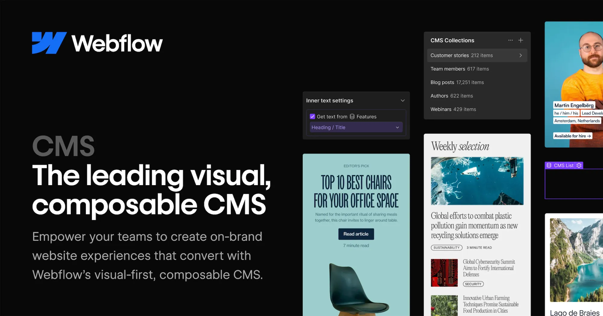
Before jumping into the technical steps, it is important to understand what Webflow CMS actually is and how it differs from traditional content management systems like WordPress or Drupal. Webflow CMS is a structured content layer built directly into the Webflow Designer. It allows you to define custom content types called Collections, which act as databases that hold structured, repeatable content. Think of Collections as spreadsheets where each row is a piece of content and each column is a field that defines the properties of that content. Once you define a Collection, Webflow generates individual pages for each item automatically, based on a design template you create once and apply universally.
This approach is fundamentally different from page-by-page website building. Instead of creating a separate page for every blog post, product, team member, or case study, you create one template that dynamically pulls data from your Collection. This means adding a new blog post is as simple as filling in a form, and your website instantly generates a fully designed, consistent page without any additional design or development work. The power of this model becomes especially apparent at scale. Imagine managing a catalog of 500 products or a blog with 300 articles. With Webflow CMS, all of that content is structured, searchable, filterable, and automatically presented through your design templates.
The starting point for any dynamic content experience in Webflow is creating a Collection. To begin, open your project in the Webflow Designer and navigate to the CMS panel, which is accessible from the left sidebar. Click on the option to create a new Collection and give it a descriptive name that reflects the type of content it will hold. Common Collection names include Blog Posts, Team Members, Projects, Products, Testimonials, Services, and Events. The name you choose should clearly describe the data structure you are building.
After naming your Collection, you will define its fields. Webflow offers a rich library of field types to accommodate virtually any kind of content. Plain text fields are suitable for titles, names, and short descriptions. Rich text fields support formatted long-form content with headings, bold text, images, links, and embedded media. Image fields hold visual assets and can be configured with alt text and dimensions. Number fields work for pricing, ratings, quantities, and similar numerical data. Date fields allow you to capture publication dates, event schedules, deadlines, and more. Option fields let you define a fixed list of choices, like a category selector or status indicator. Reference fields are one of the most powerful features, allowing you to link items in one Collection to items in another, creating relational data structures that mirror how real-world information connects.
Once your fields are defined, you can begin adding content items. Each item in a Collection represents one piece of content, such as one blog post or one team member profile. You fill in the field values for each item through a clean, form-based editor that requires no technical knowledge. Webflow also provides a CSV import option, which is invaluable when migrating existing content from another platform or populating a large Collection quickly.
With your Collection populated with content, the next step is designing the pages that will display that content. Webflow CMS introduces two page types specifically for dynamic content: Collection List pages and Collection Template pages. Understanding the difference between these two is essential for building a well-structured dynamic site.
A Collection List page is a page that displays multiple items from your Collection, typically in a grid or list format. This is the kind of page you would use for a blog index, a portfolio overview, a product catalog, or a team directory. On this page, you add a Collection List component from the Add panel. Once placed, you bind it to your chosen Collection, and Webflow automatically populates it with your Collection items. You then design a single repeating item inside the Collection List, and Webflow mirrors that design across all items in your Collection. You can connect any element inside the list item to a field in your Collection by clicking on the element, opening its settings, and selecting the appropriate field to bind. For example, you might bind an image element to your featured image field, a heading to your title field, a paragraph to your excerpt field, and a link to your post's URL.
A Collection Template page is automatically generated when you create a Collection. It represents the individual page for each item in your Collection. This is where you design the full, detailed view of a single piece of content, such as an entire blog post, a complete product detail page, or a full team member biography. On the Collection Template page, every element you add can be bound to a field from that Collection. This means every blog post in your Collection will be displayed using the same visual structure, with the dynamic data filling in the content specific to each post. Once you design the template, you never need to touch it again unless you want to change the visual design. Adding new content items automatically creates new pages following the same template.
One of the most visually satisfying aspects of working in Webflow CMS is the way it allows you to bind real data to design elements without writing a single line of code. This is done through the Get Text From or Get Image From panels that appear when you select an element inside a Collection List or Collection Template page. Webflow calls this process connecting elements to fields.
To connect a text element, you select the element in the canvas, open its settings panel, and click the field binding icon. A dropdown appears showing all the text-compatible fields from your Collection, and you simply select the one you want. Webflow immediately replaces the placeholder text with the field name, indicating the connection is live. When viewing the actual item pages, that placeholder is replaced with the real content from your database. The same process applies to images, video links, background images, visibility toggles, color swatches, and even class names, giving you a remarkable degree of dynamic control over the visual presentation of your content.
You can also bind data to styling properties, which opens up creative possibilities. For example, if your Collection has a color field for each category, you can bind that color field to the background color of a tag element, so each category automatically displays with its associated color. This kind of data-driven design is what separates Webflow CMS from simpler page builders. Your design adapts to your content rather than requiring manual design updates every time the content changes.
Displaying all items in a Collection on a single page is sometimes exactly what you need, but often you will want to show a curated subset of your content. Webflow CMS provides powerful filtering and sorting controls built directly into the Collection List settings. These controls allow you to define which items appear in a given list, in what order, and in what quantity, all without writing any code.
Sorting allows you to control the sequence in which items appear. You can sort by any date field, alphabetically by any text field, numerically by any number field, or by the order items were created or updated. For example, a blog Collection might be sorted by publication date in descending order so that the most recent posts appear first. A product catalog might be sorted alphabetically by name, or by price from lowest to highest.
Filtering allows you to restrict which items appear based on field conditions. You can filter to show only items where a toggle field is set to true, where a reference field matches a specific item, where a text field contains a specific value, or where a date field falls within a defined range. This becomes especially powerful when you want to show contextually relevant content. On a blog post template page, for example, you can include a Collection List of related posts filtered to show only items in the same category as the current post, creating an automatic related content section that updates dynamically based on what the reader is viewing. Working with a skilled webflow development agency can help you design these filtering strategies in ways that maximize engagement and content discoverability.
The item limit control lets you cap how many items appear in a list. A homepage section featuring your three most recent blog posts uses this feature. You set the limit to three, sort by date descending, and the section always shows the latest three posts regardless of how many total posts you have in your Collection. This kind of automated content curation dramatically reduces the maintenance burden on your team.
Real-world content rarely exists in isolation. A blog post might be written by a specific author, belong to one or more categories, and relate to a specific product. A project case study might involve multiple team members, showcase several services, and belong to an industry vertical. Webflow CMS supports relational content through Reference fields and Multi-Reference fields, which allow items in one Collection to link to one or many items in another Collection.
A Reference field creates a one-to-one or many-to-one relationship. For example, each blog post might reference one author from an Authors Collection. When you add a Reference field to your blog Collection and link it to the Authors Collection, each blog post item gets a dropdown where you select the associated author. On the blog post template page, you can then pull in data from the referenced author, such as their name, photo, and bio, to display a dynamic author card. This eliminates the need to manually copy author information into each post.
A Multi-Reference field creates a one-to-many or many-to-many relationship. For example, a project might be tagged with multiple service types from a Services Collection. By adding a Multi-Reference field linking your Projects Collection to your Services Collection, each project item can be associated with multiple services. You can then display those associated services on the project template page using a nested Collection List, creating a rich, interconnected content experience. These relational structures are at the heart of sophisticated CMS architectures, and mastering them allows you to build content experiences that rival enterprise-level platforms.
Conditional visibility is a feature in Webflow that allows you to show or hide elements on a page based on the values of CMS fields. This gives you the ability to create content that adapts its presentation depending on the data it contains, without needing JavaScript or custom code. Conditional visibility rules are applied to individual elements through the Visibility panel in the element settings.
For example, if your blog Collection has a toggle field called Featured, you can add a Featured badge element to your Collection List item and set it to only be visible when the Featured field is true. Items that are not featured will display without the badge, while featured items automatically show it. Similarly, if your product Collection has a Sold Out toggle field, you can show a sold out overlay element only when that field is true, automatically indicating unavailability without any manual design updates.
You can stack multiple conditional visibility rules to handle complex scenarios. An element might be set to appear only when a certain category is selected, a specific date has passed, or a text field is not empty. This kind of dynamic content presentation makes your website feel intelligent and responsive to its own data, which significantly improves the user experience while reducing the editorial workload required to maintain it.
One of the significant advantages of Webflow CMS is its deep integration with SEO settings at the Collection level. Each Collection Template page includes SEO fields that can be dynamically populated from your Collection data. This means every item in your Collection can have a unique, SEO-optimized title tag, meta description, Open Graph image, and URL slug, all generated automatically based on the fields you define.
In the Collection settings, you can configure the URL structure for your Collection items. For example, blog posts might follow a pattern like /blog/[post-slug], while team members might follow /team/[member-name]. Webflow auto-generates the slug from the item name by default, converting it to a URL-friendly format, but you can override it manually for any individual item. The ability to fine-tune SEO metadata at the Collection level, including setting dynamic title formulas like [Post Title] | [Site Name], ensures that every piece of dynamic content is optimized for search engines without requiring manual SEO configuration for each individual page.
Rich text fields in Webflow also render as proper HTML on the published site, preserving heading hierarchy, internal links, image alt text, and semantic markup that search engines use to understand content structure. Combined with Webflow's clean code output and fast hosting infrastructure, this makes Webflow CMS a strong platform choice for content-heavy sites where organic search traffic is a priority. Professional webflow development services recognize these SEO capabilities as a major factor when recommending Webflow to content-driven clients.
Once your Collections are structured and your templates are designed, the day-to-day workflow of managing CMS content in Webflow is straightforward and requires no technical knowledge. Content editors can add new items, update existing ones, and manage the publishing status of any item directly from the Webflow Editor, which is a simplified interface that overlays the live site. Editors can click on any CMS element on the page and edit its content inline, making it feel intuitive and visual rather than abstract and form-heavy.
Each Collection item has a published and draft status. Items in draft status are not publicly visible on the site but can be previewed by logged-in collaborators. This workflow supports content review processes, allowing writers to prepare content in draft, have it reviewed, and then publish it when it is ready. Items can also be scheduled for future publication by setting a publish date, which is useful for editorial calendars and timed announcements.
Webflow also provides a robust collaboration system. Multiple team members can be granted Editor access, allowing them to manage content without access to the design environment. This separation of concerns, where designers control the visual system and editors control the content, is a hallmark of professional content management workflows. It ensures that the visual integrity of your site is protected while giving content teams the autonomy they need to move quickly.
Webflow CMS does not operate in isolation. It integrates with a growing ecosystem of tools and platforms that extend its capabilities significantly. Through Zapier, Make, or native integrations, you can connect Webflow CMS to CRMs, email marketing platforms, analytics tools, form processors, and project management systems. New items added to a Collection can automatically trigger actions in other tools, such as sending a notification email, creating a task in Asana, or posting to a Slack channel.
Webflow Logic, the platform's built-in automation builder, allows you to create workflows triggered by form submissions and other site interactions. These workflows can create or update CMS items, send emails, and connect to external APIs, bringing a level of automation to your site that would traditionally require custom backend development. For example, a job application form might automatically create a new item in a Job Applications Collection, complete with all the submitted data, while simultaneously notifying the hiring team via email.
For developers who want to go even further, the Webflow CMS API provides programmatic access to your Collections and items. You can read, create, update, and delete CMS items through REST API endpoints, enabling custom integrations, headless content architectures, and sophisticated data pipelines. This is particularly valuable for brands running complex digital operations where Webflow serves as the front-end presentation layer while specialized backend systems handle data processing and storage. This level of extensibility is one of the core reasons businesses choose to work with a professional webflow development agency when building complex, scalable digital experiences.
Webflow CMS represents a genuinely transformative approach to dynamic content on the web. By combining a structured, relational database with a fully visual design environment, it removes the traditional barriers between content architecture and design execution. You no longer need to choose between a powerful CMS that requires developer intervention and a beautiful design tool that lacks content management sophistication. Webflow gives you both in a single platform. The features covered in this guide, from Collection setup and template design to filtering, relational data, conditional visibility, SEO configuration, and publishing workflows, represent a comprehensive toolkit that supports everything from simple blogs to complex, enterprise-scale content platforms.
What makes Webflow CMS especially compelling is the way it scales with your ambitions. You can start simple, with a single Collection and a straightforward template, and incrementally add sophistication as your content needs grow. The platform rewards investment in learning its systems by unlocking increasingly powerful capabilities. Whether you are managing a personal portfolio, running a content marketing operation, or overseeing a multi-brand digital ecosystem, the skills you develop working with Webflow CMS will serve you consistently. The future of web content is dynamic, personalized, and scalable, and Webflow CMS is built precisely to deliver that future in an accessible, design-forward way that puts creative teams in full control of their digital presence.
Building a SaaS website is one of the most consequential decisions a software company can make. Your website is not just a digital brochure; it is the first touchpoint where potential customers form impressions, evaluate your product, and decide whether to start a free trial or walk away. The challenge for many SaaS founders and marketing teams is choosing the right platform to build on. Webflow has emerged as one of the most powerful and flexible no-code platforms for creating professional, high-converting SaaS websites without writing a single line of traditional code. It combines the visual freedom of a designer tool with the structural integrity of a developer-grade CMS, making it the go-to choice for growth-focused SaaS teams around the world.
Whether you are launching a brand-new SaaS product or redesigning an existing site to improve conversions, this guide walks you through every stage of the process. From initial planning and structuring your information architecture to designing key landing page sections, setting up a CMS blog, integrating third-party tools, and preparing your site for launch, you will find detailed, actionable advice throughout this post. This is not a surface-level overview. It is a deep dive into building a SaaS website on Webflow that actually drives signups, communicates value clearly, and scales alongside your business.
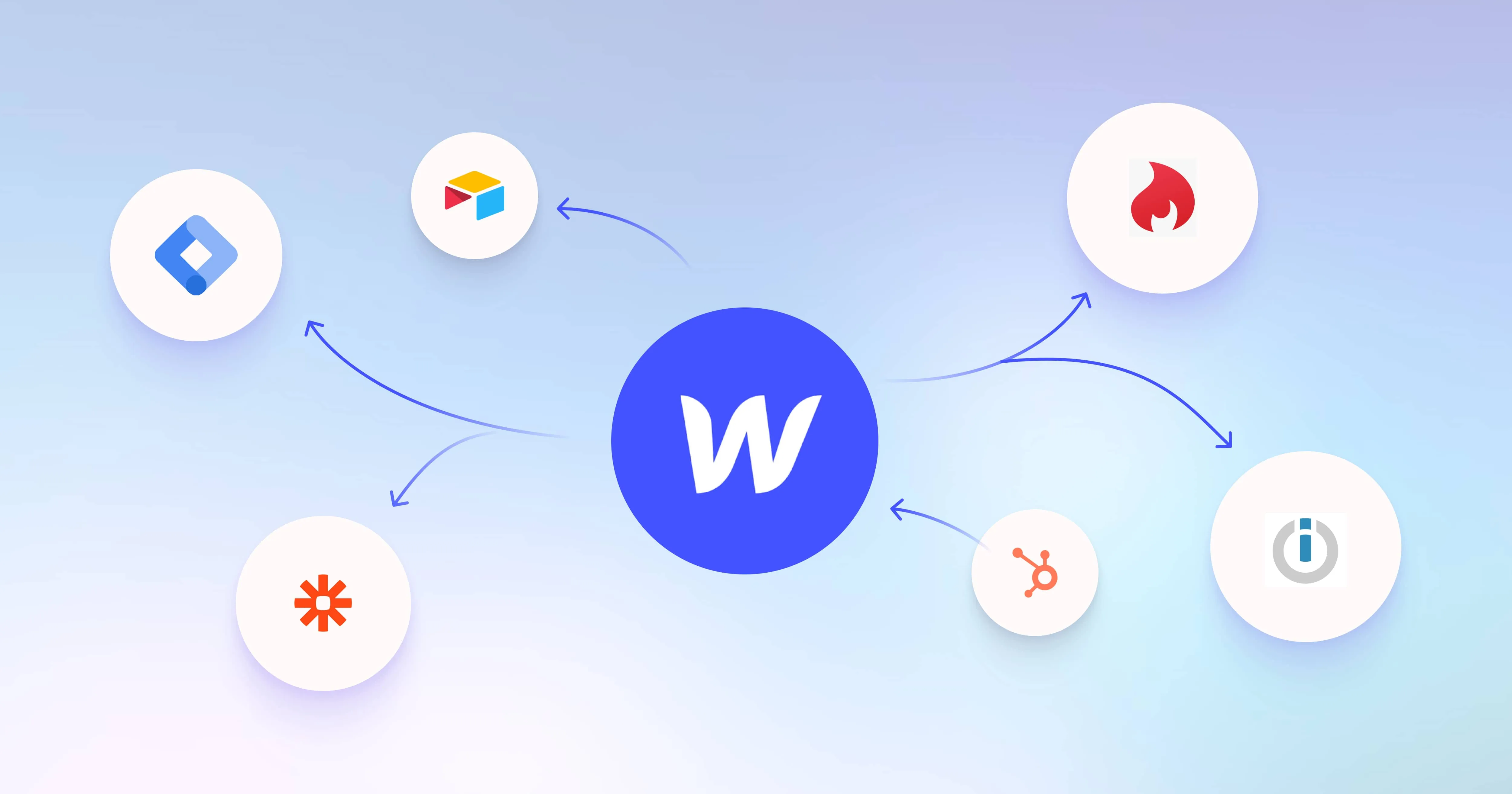
Before jumping into the how, it is worth understanding the why. Webflow sits in a unique position in the web building ecosystem. Unlike WordPress, which requires constant plugin management and developer involvement for anything beyond the basics, Webflow gives designers and marketers full control over layout, animation, interactions, and content management without ever touching code. Unlike Squarespace or Wix, Webflow generates clean, semantic HTML and CSS that meets modern SEO and performance standards.
For SaaS companies specifically, Webflow offers several critical advantages. First, it provides a visual CMS that allows marketing teams to update landing pages, blog posts, pricing sections, and customer case studies independently, without going through an engineering bottleneck. Second, Webflow supports complex animations and scroll-based interactions natively, which are essential for communicating abstract software features in an engaging way. Third, it produces fast-loading pages out of the box, which directly impacts conversion rates and search engine rankings.
Many growing SaaS companies have turned to a professional webflow development agency to handle the initial build because the platform, while accessible, has a learning curve when it comes to advanced interactions, responsive design, and CMS architecture. Working with specialists can compress timelines significantly and ensure the foundation of the site is scalable and maintainable long-term.
Every successful Webflow build starts with a clear plan. For a SaaS website, this means mapping out the pages you need, defining the user journeys you want to create, and identifying the core conversion actions you want visitors to take. Most SaaS websites share a common set of pages: a homepage, a features or product page, a pricing page, a blog or resources section, customer testimonials or case studies, an about page, and a contact or demo booking page.
Start by creating a simple sitemap. This does not need to be complex. A spreadsheet or a simple diagram showing how pages connect to each other is enough at this stage. The goal is to understand the full scope of the project before you open Webflow. Think about your buyer journey. A visitor landing on your homepage for the first time needs to immediately understand what your product does, who it is for, and why they should care. From there, they might explore features in more depth, check your pricing, and read a few case studies before deciding to sign up or book a demo.
You should also plan your CMS collections at this stage. Webflow CMS allows you to create structured content types such as blog posts, case studies, feature pages, changelog entries, and team member profiles. Define what fields each collection needs before you start building. For example, a blog post collection might include a title, author, publish date, featured image, category, and body content. Thinking this through early prevents costly restructuring later.
Once your plan is in place, open Webflow and create a new blank project. Resist the temptation to start from a template unless you are deeply familiar with how the template is structured. Templates can seem like a shortcut but often contain bloated code and structural decisions that do not fit your specific needs. Starting from a blank canvas gives you full control.
The first thing to configure in your new project is your style guide. Go to the Style Manager and define your global typography, color palette, and spacing scale. Use Webflow's global class system to create reusable styles for headings, body text, buttons, links, and containers. This ensures visual consistency across every page you build and makes future updates dramatically faster. Define your primary brand color, secondary colors, and neutrals. Set your font stack using Google Fonts or upload a custom typeface.
Next, create your global components in Webflow's component system. Your navigation bar and footer will appear on nearly every page, so build them as components that can be updated in one place and reflected everywhere. Your navigation should include your logo, main navigation links, and a clear call-to-action button such as Start Free Trial or Book a Demo. Your footer should include secondary navigation links, social media icons, a brief description of your product, and your legal pages.
The homepage is the most important page on any SaaS website. It needs to do a lot of heavy lifting in a very short amount of time. Research consistently shows that visitors make judgments about a website within seconds of landing on it, so clarity, visual hierarchy, and a compelling value proposition are non-negotiable.
Hero Section
The hero section sits above the fold and is the first thing every visitor sees. It should contain a headline that clearly states what your product does and who it helps, a subheadline that expands on the benefit, a primary call-to-action button such as Get Started for Free, and a supporting visual such as a product screenshot, dashboard mockup, or short looping animation. In Webflow, you can design this section with complete pixel-level precision and add subtle scroll-triggered animations to make the product visuals appear as the page loads.
Social Proof and Trust Signals
Immediately below the hero, include a social proof strip. This could be a row of customer logos, a trust badge from G2 or Capterra, a count of active users, or a short pull quote from a satisfied customer. Social proof reduces skepticism and increases the likelihood that a visitor will continue reading. Webflow makes it easy to build these sections with flexbox layouts and Lottie animations for logos.
Features and Benefits Section
Rather than listing features in a plain grid, use Webflow's interactions to create an engaging features showcase. A popular pattern for SaaS homepages is the sticky scroll feature section, where as the user scrolls down, each feature section animates into view while a sticky product screenshot on the other side updates to show the relevant interface. This pattern communicates complexity in a digestible, engaging way without overwhelming visitors.
The pricing page is often the most visited page on a SaaS website after the homepage, and it is where many conversion decisions are made. Getting it right requires a combination of clear structure, psychological pricing principles, and trust-building elements. In Webflow, you can build a fully custom pricing page without any limitations on layout or interactivity.
Start with a clean three-column pricing table showing your core plans. Use visual hierarchy to draw attention to your recommended plan by making it slightly larger, adding a highlighted border, or including a Most Popular badge. Each plan should clearly list what is included and use simple, jargon-free language. Webflow's grid system makes building responsive pricing tables straightforward.
Add a monthly versus annual billing toggle using Webflow's custom interactions and conditional visibility. This is a feature that many SaaS companies use to encourage annual subscriptions by showing the discounted monthly price when users select annual billing. In Webflow, you can achieve this with a custom toggle interaction that swaps text content between two sets of price labels. Below the pricing table, include an FAQ section addressing common pricing questions and a section with customer testimonials to reinforce the value at the point of decision.
Content marketing is one of the most sustainable and cost-effective growth channels for SaaS companies. A well-maintained blog drives organic search traffic, establishes authority in your niche, and nurtures potential customers throughout their buying journey. Webflow's CMS is purpose-built for this use case and gives you complete design freedom over how your content is displayed.
To set up your blog, navigate to the CMS section in Webflow and create a new Blog Posts collection. Add all the fields you need: title, author, publish date, category, tags, featured image, meta description, body content (rich text field), and a related posts reference field. Once your collection is configured, create a Collection List on your blog index page to display all posts and a Collection Template page that serves as the layout for individual blog articles.
Design your blog template page to be highly readable. Use a comfortable line length of roughly 65 to 75 characters per line, generous line spacing, and clear typographic hierarchy with distinct heading levels. Add a sticky table of contents sidebar for longer articles, a progress bar at the top of the page to show reading progress, and a related articles section at the bottom to reduce bounce rate and keep readers engaged. All of these elements can be built natively in Webflow without any external plugins.
Webflow gives you exceptional control over on-page SEO, and taking advantage of these tools is essential for driving organic growth. Every page in Webflow has its own SEO settings panel where you can set the page title tag, meta description, Open Graph image, and canonical URL. For CMS-driven pages like blog posts, these fields are dynamically populated from your collection item data, which means you can set them once at the template level and they will auto-generate correctly for every post.
Structure your page headings correctly using proper H1, H2, and H3 hierarchy. Every page should have exactly one H1 that contains the primary keyword you are targeting. Use H2 tags for main section headings and H3 tags for sub-points within those sections. Webflow makes this easy because you explicitly choose the heading level for every heading element rather than relying on visual styling to infer hierarchy.
Page speed is a critical SEO ranking factor and also directly impacts conversion rates. Webflow generates lean, production-ready HTML and CSS without the bloat common in WordPress themes. Take additional steps to optimize images by uploading WebP format images, enabling lazy loading on images below the fold, and keeping your custom code embeds to a minimum. Use Webflow's built-in asset optimization features and connect your site to a CDN through Webflow Hosting for fast global load times.
For SaaS companies scaling their content programs, working with a webflow development agency that specializes in technical SEO and Webflow architecture can help you build a site structure that supports long-term organic growth. This includes setting up proper internal linking architecture, creating programmatic landing pages with CMS collections, and implementing schema markup for rich results in search engines.
A SaaS website cannot live in isolation. It needs to connect with your marketing stack, analytics platforms, customer support tools, and product infrastructure. Webflow supports integrations through native embeds, Zapier, Make (formerly Integromat), and direct webhook connections.
For analytics, add Google Analytics 4 and Google Tag Manager through Webflow's custom code settings. Tag Manager acts as a container that allows your marketing team to deploy tracking scripts, conversion events, heatmap tools like Hotjar or Microsoft Clarity, and A/B testing platforms like Google Optimize without requiring code changes in Webflow itself. This separation of concerns is a best practice that keeps your site lean and gives marketers the autonomy they need.
For email capture and CRM integration, Webflow's native forms can send submissions to any email address or connect to over 5,000 apps through Zapier. Connect your forms to your email marketing platform such as HubSpot, Mailchimp, or ConvertKit so that new leads are automatically added to your nurture sequences. For product demo booking, embed a Calendly or Chili Piper scheduling widget directly into your demo page using an HTML embed block.
Live chat and support integrations such as Intercom, Crisp, or Drift can be added through a single script embed in your project settings. These tools are critical for SaaS websites because they let potential customers ask questions in real time, which significantly reduces friction in the conversion process. Configure them to show proactively on high-intent pages like pricing and contact pages while staying minimized on content pages to avoid distracting readers.
A majority of web traffic now comes from mobile devices, and search engines use mobile-first indexing to determine rankings. Every page you build in Webflow must be fully responsive and look excellent on all screen sizes. Webflow's responsive design system allows you to customize layouts, font sizes, spacing, and visibility at four breakpoints: desktop, tablet, mobile landscape, and mobile portrait.
The most important principle to internalize is that styles cascade downward in Webflow. Styles set at the desktop breakpoint flow down to smaller screens unless you explicitly override them. This means you should always design desktop first, then refine at smaller breakpoints. Pay special attention to your navigation on mobile. The standard pattern is to hide the desktop nav links and replace them with a hamburger menu button that triggers a full-screen or slide-in menu. Webflow's interaction system makes this straightforward to implement without any custom JavaScript.
Test your responsive design thoroughly using Webflow's preview mode across all breakpoints and also on real devices. Common issues to watch for include text that is too small to read comfortably, touch targets that are too small for fingers, horizontal scrolling caused by elements that overflow the viewport, and images that do not scale correctly. Address each of these before moving on to the launch phase.
Before you publish your Webflow site, conduct a thorough quality assurance review. This process should cover several categories. First, review all content for spelling, grammar, and factual accuracy. Second, test all forms to confirm submissions are being received and routed to the correct destinations. Third, click every link on the site to verify there are no broken links or incorrect redirects. Fourth, check all pages on mobile, tablet, and desktop browsers including Chrome, Safari, Firefox, and Edge.
Use Webflow's built-in SEO audit tools to check for missing meta descriptions, pages without H1 tags, images without alt text, and other common on-page issues. Run your key pages through Google PageSpeed Insights to identify performance bottlenecks. Aim for a score of 90 or higher on both mobile and desktop. If you notice significant performance issues, common culprits include large unoptimized images, excessive JavaScript from third-party scripts, and render-blocking resources.
Set up Webflow's 301 redirect manager if you are migrating from an existing website. Redirecting old URLs to their new equivalents preserves your SEO equity and prevents visitors from landing on 404 error pages. Create a comprehensive redirect map listing every old URL and the corresponding new URL before launch day, then enter them into Webflow's redirect settings in bulk.
Publishing your Webflow site is as simple as clicking the Publish button, but there are a few configuration steps to complete first. Connect your custom domain through Webflow's hosting settings and configure your DNS records according to Webflow's documentation. Enable SSL for your domain to ensure your site loads over HTTPS, which is required for security, user trust, and SEO. Set up your sitemap and submit it to Google Search Console so that Google can discover and index your pages efficiently.
After launch, establish a regular maintenance routine. Review your Google Analytics and Search Console data weekly to understand which pages are performing well and which need improvement. Update your blog with fresh content on a consistent schedule, at minimum twice per month, to signal to search engines that your site is actively maintained. Monitor your Core Web Vitals scores in Search Console and address any issues that arise as you add new content and integrations.
Run conversion rate optimization experiments on your key pages using A/B testing tools. Test different headlines, call-to-action button copy, hero images, and pricing page layouts to find the combinations that drive the most signups. Small improvements in conversion rate compound significantly over time and can have a greater impact on revenue than increasing traffic alone.
Building a SaaS website in Webflow is an investment that pays dividends for years when done correctly. The platform gives you the design freedom of a custom-coded site combined with the flexibility and speed of a modern CMS, making it uniquely suited to the fast-moving world of SaaS. By following the steps outlined in this guide, including planning your structure thoughtfully, designing for conversion at every stage, setting up a powerful content hub, integrating your marketing tools, and optimizing for both SEO and performance, you will have a website that works as hard as your product does to drive growth.
The journey does not end at launch. A great SaaS website is a living asset that evolves alongside your product, your customers, and the competitive landscape. Continuously test, iterate, and improve. If you find the platform's learning curve steep or want to move faster in the initial build phase, partnering with a specialized webflow development agency can be a smart strategic move that gives you a production-ready site built on best practices from day one. Whatever path you choose, Webflow provides the tools you need to create a world-class SaaS web presence that converts visitors into loyal customers.
The no code revolution has completely transformed how businesses and individuals approach website creation. What once required a full team of developers and weeks of engineering work can now be accomplished by a single person with the right platform and a clear vision. As the market continues to mature, two platforms have emerged as dominant forces in the conversation: Webflow and Lovable. Each takes a fundamentally different approach to solving the same problem, yet both promise to help users build beautiful, functional websites without writing a single line of traditional code. Whether you are a startup founder trying to validate an idea quickly, a designer looking to bring creative concepts to life, or a growing business seeking a scalable digital presence, the platform you choose will have a lasting impact on your workflow, your product, and your ability to grow. Understanding the real differences between these two tools goes far beyond comparing feature checklists; it requires a deep look at philosophy, capability, and long-term potential.
This comprehensive guide breaks down every major dimension of both platforms so you can make a truly informed decision. We will explore design flexibility, technical depth, AI capabilities, pricing, scalability, e-commerce support, SEO performance, and ideal use cases for each tool. Whether you are evaluating these platforms for the first time or reconsidering your current setup, this article will give you the clarity you need. And for businesses that want the maximum power of professional-grade web design combined with expert guidance, understanding what a Webflow development agency can offer adds another critical layer to this decision.
Before comparing specific features, it is essential to understand the foundational purpose of each platform, because that underlying philosophy shapes every other decision that the tool makes on your behalf.
Webflow is a professional-grade visual web development platform that allows designers and developers to build production-ready websites through a drag-and-drop canvas that maps directly to real HTML, CSS, and JavaScript. Founded in 2013, Webflow has grown into one of the most sophisticated tools in the no code space. It is not a template-first builder where you simply swap out text and images. Instead, it is a full visual development environment where you control every box model, flexbox layout, grid system, interaction, and animation with precision. The platform generates clean, semantic code that closely mirrors what a hand-coded site would produce. Webflow also includes a powerful CMS for content-driven websites, robust hosting infrastructure, and an extensive ecosystem of integrations. It is the platform of choice for professional designers, creative agencies, and marketing teams who want pixel-perfect control without sacrificing performance.
Lovable is an AI-powered application builder that takes a fundamentally different approach. Rather than asking you to manipulate a visual canvas, Lovable allows you to describe what you want in plain English and then uses artificial intelligence to generate the underlying code, layout, and functionality. It is designed to help non-technical users ship web applications and landing pages extremely fast, often in a matter of minutes. Lovable is particularly powerful for building React-based single-page applications, internal tools, and MVP products. It connects with Supabase for backend functionality, enabling authentication, databases, and real-time data without any manual setup. The platform is positioned as a conversational development tool that lowers the barrier to entry almost entirely, making it accessible to entrepreneurs, product managers, and anyone who has an idea but lacks formal design or development training.
Design freedom is one of the most important factors for any business that takes its brand seriously. A website is often the first impression a potential customer has of your company, and the ability to differentiate your visual identity from every competitor can directly influence conversion rates, trust, and revenue.
Webflow delivers an unmatched level of design precision in the no code space. Every element on the canvas can be sized, positioned, styled, and animated with granular control. You can build complex responsive layouts using CSS Grid and Flexbox, create custom scroll-triggered animations, design hover states, define component libraries, and maintain a global style guide that propagates changes across the entire site. The platform supports custom fonts, variable fonts, SVGs, and advanced typography settings. Designers who are familiar with tools like Figma or Adobe XD will find that Webflow translates their creative vision into the browser with very little compromise.
Lovable, by contrast, generates interfaces based on your text prompts and the decisions made by its AI model. While the results can be surprisingly attractive and functional, you are ultimately working with AI-generated design choices rather than making them yourself. You can iterate on those choices through follow-up prompts, but achieving the level of precision and brand specificity that Webflow provides is significantly harder. Lovable is better suited for functional applications where the primary goal is utility, not visual storytelling. If your brand relies on distinctive aesthetics, rich motion design, or highly customized user experiences, Webflow is the clear winner in this category.
Artificial intelligence has entered every corner of the software industry, and both Webflow and Lovable are incorporating AI in meaningful ways, though their approaches reflect the different philosophies at the core of each product.
Lovable is fundamentally built around AI. The entire development experience is conversational. You tell the system what you want, it writes the code, renders the result, and lets you continue refining through dialogue. This makes Lovable extraordinarily fast for rapid prototyping and MVP development. It can wire up authentication flows, create data tables, connect forms to databases, and generate entire page layouts in a single conversation turn. For users with no technical background, this represents a genuinely transformative capability that removes barriers that previously required months of learning or significant budget for developers.
Webflow has introduced its own AI features, including AI-powered copy generation and layout suggestions, and continues to expand these capabilities. However, Webflow's AI tools are assistive rather than generative at the core. They help you work faster within the visual editor rather than replacing the editor itself. This is intentional; Webflow is built for professional outcomes, and its AI tools are designed to enhance the workflow of someone who already knows what they are building, not to generate the entire product from a description. For users who want AI to drive the majority of the development process, Lovable has a meaningful advantage. For users who want precise control with AI as a co-pilot, Webflow is the more appropriate choice.
For businesses that publish content regularly, whether blog posts, case studies, product updates, or portfolio entries, the CMS capabilities of a platform can make or break the entire workflow.
Webflow's CMS is one of the most powerful content management systems available outside of traditional developer-built solutions. You can define completely custom content structures with any combination of text fields, images, rich text, references, and multi-references. Once a structure is defined, you design CMS-powered templates visually, meaning you connect design elements directly to content fields and the layout automatically populates for every entry. This makes it possible to build sophisticated content hubs, news platforms, resource libraries, and portfolio sites that are easy for non-technical content editors to manage while still delivering exceptional design quality. The CMS also supports nested collections, conditional visibility based on content fields, and API access for headless implementations.
Lovable does not have a dedicated CMS in the traditional sense. Since it generates React applications, you can connect to external data sources through Supabase or build custom data structures within the application itself, but this requires a more technical approach. For content-heavy websites that need structured publishing workflows, Webflow is the far superior option. Lovable is better suited to applications where the content is dynamic and user-generated rather than editorially managed.
For businesses selling products or services online, e-commerce functionality is a critical consideration. Both platforms offer paths to online selling, but they differ significantly in maturity and depth.
Webflow has a native e-commerce solution that allows you to build fully designed online stores with complete visual control over every page of the shopping experience: product pages, collection pages, cart, checkout, and order confirmation screens. You can customize every element of the buying journey to match your brand, set up product variants, manage inventory, configure shipping rules, and integrate payment processors. For businesses where the shopping experience is part of the brand differentiation, this level of control is invaluable. Many e-commerce businesses work with a Webflow development agency to set up sophisticated stores that would be impossible to achieve with more constrained platforms.
Lovable can build e-commerce interfaces through AI generation and Supabase integration, but it lacks the native, polished e-commerce infrastructure that Webflow provides out of the box. Building a complete online store in Lovable is possible but requires significantly more prompt iteration and technical understanding to achieve results that are production-ready. For most e-commerce use cases, Webflow is the more reliable and capable choice.
Search engine optimization is not just a marketing consideration; it is a technical discipline that depends heavily on the quality of the code and infrastructure underlying your website. This is an area where the two platforms show a very clear divide.
Webflow is one of the best no code platforms for SEO. It generates clean, semantic HTML that search engines can crawl and index effectively. Every page allows you to set custom meta titles, meta descriptions, Open Graph images, canonical URLs, and structured data. The platform produces fast-loading pages by default, with global CDN delivery, automatic image optimization, and efficient asset loading. You can manage redirects, set up sitemaps, and control indexing rules with precision. Webflow's hosting infrastructure is powered by Fastly and Amazon CloudFront, ensuring excellent Core Web Vitals scores which are a direct Google ranking factor.
Lovable generates React applications that are client-side rendered by default, which can present challenges for SEO. Search engine crawlers handle JavaScript-heavy pages less reliably than server-rendered HTML, and without additional configuration, Lovable-generated sites may struggle to achieve the same indexing performance as Webflow sites. For applications where SEO is not a primary growth channel, this is a minor concern. However, for any business relying on organic search traffic to generate leads or sales, Webflow's technical SEO foundation is a significant and potentially decisive advantage.
Pricing is always a practical consideration, but it needs to be evaluated in the context of what you are actually getting for your investment and how that value scales as your business grows.
Webflow offers a tiered pricing structure that includes free plans for learning and experimentation, site plans for hosting published websites, and workspace plans for team collaboration. Paid site plans start at a competitive rate and scale to enterprise-level pricing with features like custom logic, additional CMS items, higher bandwidth, and priority support. For e-commerce, additional transaction and plan fees apply. While Webflow is not the cheapest option on the market, the value it delivers in terms of design capability, hosting quality, CMS power, and scalability makes it excellent value for professional use. Working with a Webflow development agency further extends the value, as experienced teams can build complex, scalable solutions that would take much longer to achieve independently.
Lovable offers a free tier with a limited number of monthly messages or AI generation requests, with paid plans unlocking higher usage limits and additional features. The pricing is accessible and reflects the product's positioning as a tool for individuals and early-stage teams moving quickly. For users who are primarily prototyping or building internal tools, Lovable's pricing represents good value. However, for teams scaling into production with complex requirements, the cost-to-capability comparison shifts in Webflow's favor.
The accessibility of a platform directly affects how quickly a team can become productive and how dependent they will be on outside help to maintain and grow their digital presence.
Webflow has a well-documented learning curve. Because it exposes real web development concepts through its visual interface, users need to understand at least basic layout principles, responsive design, and how CSS properties interact. For complete beginners, this can be intimidating at first. However, Webflow University, the platform's free educational resource library, is widely regarded as one of the best learning resources in the no code space. With a few weeks of dedicated learning, most design-savvy users can become highly productive. The investment in learning pays off enormously, as mastery of Webflow unlocks capabilities far beyond what any simpler builder can provide.
Lovable has the lowest possible learning curve of any tool discussed in this comparison. If you can type a sentence, you can start building in Lovable. The conversational interface removes virtually every technical barrier, making it genuinely accessible to anyone regardless of their background. This is Lovable's strongest competitive advantage for first-time builders. The tradeoff is that when things go wrong, or when you need to make very specific adjustments that the AI does not interpret correctly, you may find yourself iterating through many prompts or needing to understand the generated code to fix issues manually.
As a business grows, the platform it relies on needs to grow with it. Choosing a tool that cannot handle increased traffic, complexity, or team size can create costly and time-consuming migration projects down the line.
Webflow is purpose-built for scalability. Its hosting infrastructure handles enterprise-level traffic without requiring users to manage servers or configure CDN settings manually. The platform supports team workspaces with role-based access controls, making it appropriate for large organizations with multiple contributors. Webflow's Localization feature enables multi-language sites from within the same project, and its headless CMS capabilities allow it to serve content to any front-end application. Many globally recognized brands use Webflow for their marketing sites, demonstrating its ability to operate at scale. Webflow development is an established professional discipline with a thriving ecosystem of partners, plugins, and integrations that support complex requirements.
Lovable is primarily optimized for speed and early-stage development rather than enterprise scale. It is excellent for getting from zero to one quickly, but organizations with complex permissions, large teams, strict compliance requirements, or deeply customized workflows may find that Lovable's current feature set does not yet support their needs. The platform is evolving rapidly, and this gap may narrow over time, but for businesses that need proven scalability today, Webflow holds a significant advantage.
Choose Webflow if you need any of the following:
Choose Lovable if you need any of the following:
Webflow and Lovable are both remarkable tools that represent the best of what the modern no code movement has to offer, yet they are built for different people with different goals. Lovable's AI-driven, conversational approach is genuinely revolutionary for speed and accessibility, making it one of the most exciting tools for entrepreneurs and early-stage builders who need to move fast and validate ideas without technical overhead. It removes every barrier and puts the power to create in the hands of anyone willing to describe their vision clearly. But accessibility comes with tradeoffs in precision, SEO performance, content management depth, and long-term scalability that matter enormously for businesses that are building for sustained growth.
Webflow, meanwhile, stands as one of the most powerful and complete platforms ever built for professional web design and development without writing traditional code. Its combination of visual precision, clean code output, robust CMS, enterprise-grade hosting, and a thriving ecosystem of Webflow development professionals makes it the platform of choice for businesses that are serious about their digital presence over the long term. The learning curve is steeper and the investment deeper, but the capabilities it unlocks and the results it produces are in a different class entirely. For teams that want to maximize their impact online, investing in Webflow development and working with the right expertise is one of the highest-return decisions a growing business can make. The choice ultimately depends on where you are today and where you plan to be tomorrow.
Parth Parmar is a Webflow expert in India and CTO at Appsrow, specializing in SaaS and enterprise website development.
He specializes in Webflow development, CMS architecture, performance optimization, and integrations.
Yes, he focuses on building scalable and high-performance SaaS websites.
SaaS, AI, enterprise, and technology-driven businesses.
Yes, including migration from WordPress, custom code, and other platforms.
A strong focus on performance, scalability, and conversion optimization.
From brand identity to Webflow development and marketing, we handle it all. Trusted by 300+ global startups and teams.
.webp)
.webp)
.webp)
.webp)
.webp)