


June 17, 2026
# min


Visitors should find it easy to navigate your website. A clean and intuitive menu structure guides users to the information they need quickly, improving their overall experience. Avoid cluttering your navigation bar with too many options—stick to the essentials.
Pro Tip: Use a breadcrumb trail to help users understand their location within your site.
With mobile traffic surpassing desktop usage, having a mobile-friendly design is no longer optional. Your website should adapt seamlessly to different screen sizes, providing a consistent user experience across all devices.
Pro Tip: Use responsive design frameworks like Flexbox or Grid for a dynamic layout.
A slow website can frustrate users and increase bounce rates. Optimize your site by compressing images, using a reliable hosting provider, and minimizing JavaScript or CSS files.
Pro Tip:Use tools like Google PageSpeed Insights to identify performance bottlenecks.
Your website’s color palette should align with your brand identity and evoke the right emotions. Use complementary colors to create visual harmony, but avoid overloading the design with too many hues.
Pro Tip: Leverage tools like Adobe Color to generate appealing color schemes.
Visuals play a significant role in capturing attention. Invest in high-quality images, illustrations, or videos that resonate with your audience. Ensure your media files are optimized for web use to avoid slowing down your site.
Pro Tip: Use next-gen formats like WebP for better compression without losing quality.
Your CTAs should grab attention and compel users to take action. Use contrasting colors, concise text, and strategic placement to maximize their effectiveness.
Pro Tip: Test different CTA designs and placements using A/B testing tools.
Typography significantly impacts user experience. Choose fonts that are legible across all devices and sizes. Use hierarchy and spacing to make your content more scannable.
Pro Tip: Stick to a maximum of two or three fonts to maintain consistency.
A well-designed website is useless if no one can find it. Incorporate SEO practices such as using alt text for images, optimizing meta tags, and structuring content with proper headings.
Pro Tip: Use keyword research tools to align your content with search intent.
Building trust is essential for conversions. Display testimonials, case studies, and client logos to establish credibility and showcase your expertise.
Pro Tip: Use carousels or dedicated sections for user reviews to make them more prominent.
Website design isn’t a one-and-done process. Regularly test your site’s usability, collect user feedback, and stay updated with design trends to keep it relevant.
Pro Tip: Use tools like Hotjar or Crazy Egg to analyze user behavior and identify areas for improvement.
Improving your website design doesn’t require a complete overhaul—small, incremental changes can make a big impact. By focusing on user experience, branding consistency, and modern design practices, you can create a site that engages visitors and drives results.
Ready to revamp your website? Contact us to discuss your goals and start transforming your online presence today!
The most impactful website design improvements include simplifying navigation to reduce decision fatigue, optimizing page speed for faster load times, improving mobile responsiveness, using high-contrast typography for readability, and adding clear CTAs that guide visitors toward conversion. These changes often result in significant improvements to engagement metrics within weeks of implementation. Appsrow conducts website design audits and implements targeted improvements on Webflow sites to maximize conversion and user experience.
Visual hierarchy is critical in web design because it guides visitors' eyes to the most important information first, reducing cognitive load and increasing the likelihood of conversion. Elements like font size, color contrast, whitespace, and element placement all contribute to a hierarchy that either helps or hinders user comprehension. Appsrow applies proven visual hierarchy principles on every Webflow design to ensure visitors find what they need and take the actions your business needs them to take.
Improving website design starts with a clear understanding of your target audience's expectations and the single most important action you want visitors to take, since every design decision should serve these two foundations. Removing visual clutter, establishing clear hierarchy, and placing the most important CTA in the most prominent position on each page are the highest-leverage improvements most sites can make. Appsrow performs website design audits for existing Webflow sites and delivers prioritized improvement recommendations based on conversion impact and implementation effort.
Typography improvements are among the highest-impact website design changes because clear, readable text directly affects how long visitors stay on your site and how much they trust your brand. Increasing line height, choosing high-contrast font colors, limiting to two fonts maximum, and using size hierarchy to distinguish headings from body text costs nothing to implement but dramatically improves readability and professionalism. Appsrow designs Webflow typography systems that balance brand expression with functional readability, producing text that is both distinctive and immediately legible across all devices.
Color improvements to website design involve establishing a consistent palette with one primary brand color, one accent color for CTAs, and neutral background colors that create visual breathing room rather than competing with content. Contrast ratios between text and background should meet WCAG AA standards for accessibility, which also improves readability for all users regardless of visual ability. Appsrow builds Webflow color systems as design variables that ensure brand consistency across every page and make future color updates instant rather than requiring manual changes across the entire site.
Mobile design improvements are critical because over 60 percent of web traffic comes from mobile devices, yet most websites are still designed desktop-first with mobile as an afterthought. Ensuring tap targets are at least 44 pixels, navigation is thumb-friendly, content doesn't require horizontal scrolling, and forms have appropriately sized inputs prevents the mobile experience friction that drives visitors away before converting. Appsrow designs Webflow sites mobile-first from the start, ensuring the mobile experience is as intentional and optimized as the desktop version rather than a scaled-down adaptation.
Page layout improvements that most improve conversion rates include moving the primary CTA above the fold so visitors see it without scrolling, reducing the number of competing CTAs on each page to one primary action, adding social proof elements like testimonials and client logos near decision points, and ensuring the next step is always obvious after consuming each section of content. Appsrow applies conversion rate optimization principles to Webflow layouts during the design phase, building sites where user flow naturally guides visitors toward the desired business outcome.
The most sustainable approach to continuous website design improvement is establishing a quarterly design review cycle where you analyze conversion data, user behavior from heatmaps and session recordings, and competitive design trends, then implement the highest-impact improvements in a planned update rather than making ad-hoc changes that create visual inconsistency. Appsrow structures quarterly Webflow design review retainers for clients who want their site to continuously improve based on real performance data rather than subjective design preferences.
Transform your website with expert Webflow development
From brand identity to Webflow development and marketing, we handle it all. Trusted by 50+ global startups and teams.
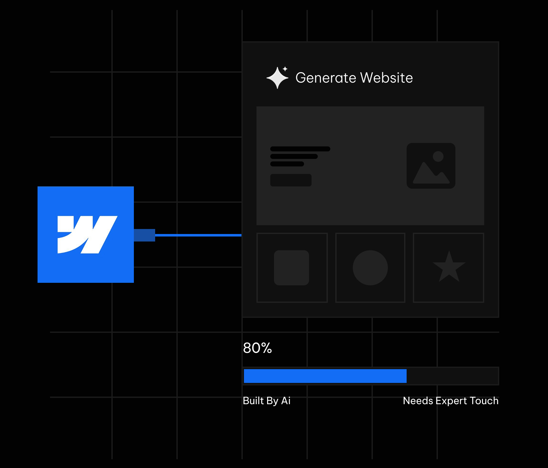
Webflow's AI site builder has become one of the most talked about features in the no code world this year. You type a prompt, describe your business, and within minutes a multi page website appears inside the Webflow Designer. It looks like magic the first time you watch it happen. The question that actually matters for a business owner or a marketing team is quieter and more practical. What does it really build, and where does it stop being useful?
We build Webflow sites for a living, so we have run the AI site builder across a wide range of briefs, from fintech landing pages to SaaS marketing sites. This guide is an honest field report rather than a hype piece. It covers what the tool does well in 2026, where it quietly leaves gaps, and how to use it so the output works for your business instead of against it. If you are still deciding whether the platform suits your project at all, it helps to first understand what Webflow actually is before judging the AI layer sitting on top of it.
The Webflow AI site builder turns a single prompt into a multi page, production ready site.
Webflow frames the feature with a simple promise: start fast, build right. You give it a prompt, and it turns that prompt into a fully customized, production ready website. The phrase that separates it from older AI website tools is production ready. It is not generating a flat mockup or a throwaway template that you abandon later. It builds a real Webflow project that opens directly in the Designer, where you keep full control over every element on the page.
On the product page, Webflow shows three example prompts that reveal the intended audience: a fintech enterprise, an AI startup, and a design agency. These are not hobby blogs or weekend portfolios. The tool is aimed at businesses that need a credible web presence quickly and a team that wants to keep refining it afterward. Webflow points to brands such as Monday.com, the New York Times, TED, and Docusign, which sets the tone for the quality level it is targeting.
This is where the 2026 version genuinely impresses. From a single prompt, here is what lands in your account.
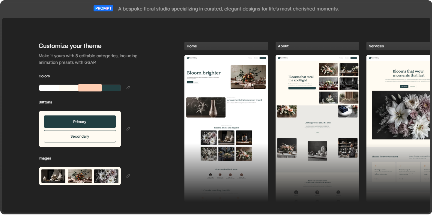
Older AI builders dropped one page on the screen and called it finished. Webflow takes a different route. It launches a website with more than just a layout. You get a functional, multi page site with a foundational design system underneath it. In the examples Webflow demonstrates, a single prompt produces a Home page, an About page, and a Services page, each filled with real sections rather than empty boxes.
Sites created with the AI site builder are built on Webflow Flowkit, Webflow's modular CSS framework. This matters more than it first sounds. Flowkit gives the generated site a structured system of reusable utilities, components, and variables. In plain terms, the colors, spacing, type, and buttons are connected through a shared logic that you can adjust globally. Change a primary color once and it updates everywhere. That is the difference between a site you can grow cleanly and a pile of disconnected styles you later have to untangle by hand.
Once the draft exists, you can make it yours through eight editable categories. These cover colors, buttons in both primary and secondary styles, images, typography, and more, including animation presets powered by GSAP. GSAP is the industry standard animation library, so having presets wired in from the start means your AI generated site can carry motion that feels designed rather than default and flat.
The tool fills the draft with images and copies that match your prompt, so the first version does not look empty. You see a coherent page with a hero, supporting sections, and visuals already in place. This is genuinely useful for getting buy-in fast, because a client or a manager can react to something real on screen instead of imagining it from a description.
Because the site is built in Webflow, it arrives ready to evolve and scale. Everything you would normally reach for is still there: the CMS, hosting, SEO controls, interactions, and the full Designer canvas. The AI does not trap you in a limited sandbox. It hands you a normal Webflow project that simply happened to be assembled quickly. If budget is part of your thinking, it helps to understand Webflow pricing for 2026 before you connect the site to a paid plan.
Webflow AI is not only a one time generator. Inside the editor you can use it to generate new pages and CMS Collection items, optimize with native SEO and AEO features, and even answer your questions while you build. That last point is quietly important in 2026, because answer engine optimization now shapes how people discover sites through AI assistants, and Webflow has been pushing its AEO features hard this year.
Webflow lays the process out in four stages, and in practice it really does follow this shape.
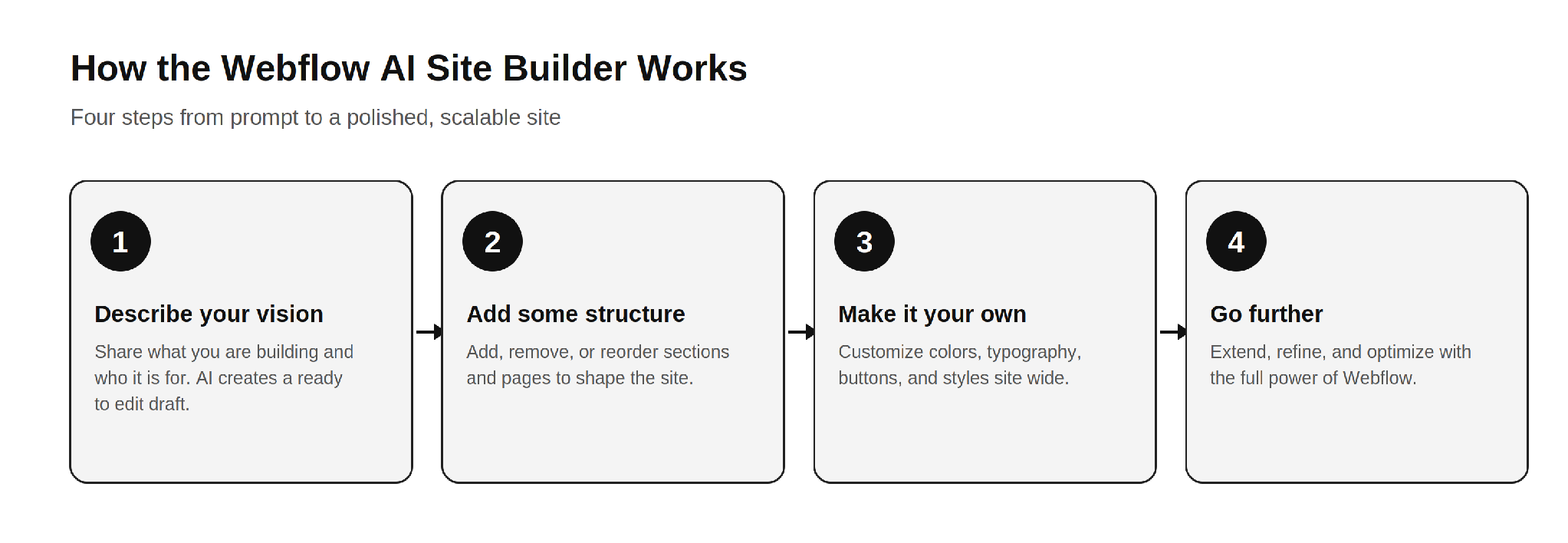
The four step Webflow AI workflow: describe, structure, customize, and refine.
The honest read on this flow is that steps one and two are where the AI saves you real time. Steps three and four are where your skill, or your agency's skill, decides whether the final site is good or merely fine. A founder using the tool recently described it as a great starting point that lets a client see the overall vision much earlier, before refining it into a polished site. That is the right expectation to carry into it.
Based on how it behaves across real projects, the tool fits a few situations very well.
If you are weighing whether to bring this in house or hire help, it is worth reading how a Webflow development company actually scopes these projects, because the AI changes where the effort goes, not whether effort is needed.
Now the part the marketing pages will not spell out. None of these are reasons to avoid the tool. They are the gaps you plan around so the final site holds up.
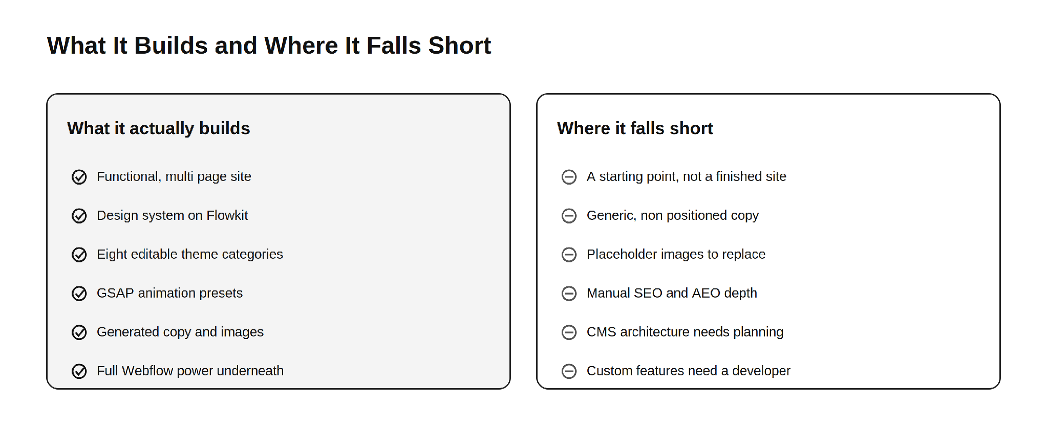
What the Webflow AI site builder delivers out of the box, and what still needs human work.
This is the single most important thing to understand. The AI site builder produces a strong first draft, not a launch ready business site. Webflow itself frames the output as a draft and a foundation. The generated copy reads as competent filler, the images are generic, and the structure is sensible but not strategic. Everything that makes a site convert, the message hierarchy, the proof, the offers, and the calls to action that match your funnel, still has to be designed by a human who understands your business.
AI generated body copy describes a business in the abstract. It does not know your differentiators, your pricing logic, your customer objections, or the exact words your buyers use. For a simple brochure site that may be tolerable for a short while. For a site that has to sell, the copy needs a rewrite grounded in real positioning. This is the same reason a thin template rarely ranks or converts on its own.
The visuals the AI places look fine at a glance, but they are placeholder quality. They are not your product, your team, or your real work. Visitors and search engines both reward authentic imagery, and original photography or properly designed graphics will always outperform generic AI fills. Plan to swap them before launch.
Webflow gives you native SEO and AEO controls, and the AI can assist, but strong organic performance is not automatic. Title tags, meta descriptions, heading structure, internal linking, schema markup, and content that genuinely answers search intent all require deliberate work. The AI hands you a clean technical base. It does not hand you a content strategy. This is where most AI generated sites quietly underperform in search and in AI answer results.
The AI can generate CMS Collection items, but designing a CMS structure that scales, with the right collections, reference fields, and relationships, is an architecture decision. Get it wrong early and you pay for it later in painful migrations and rebuilds. This is one of the clearest places where experience matters more than automation. The same is true when you compare ways to sell online, which is why teams research Webflow Ecommerce versus Shopify before committing a store to either platform.
A site that looks good is not the same as a site that performs. Conversion rate optimization, clear value propositions, friction free forms, trust signals, and tested layouts come from understanding user behavior, not from a prompt. The AI gives you a tidy canvas. Turning that canvas into a site that books demos or drives sales is human work.
Because many sites start from the same Flowkit foundation and similar prompts, AI generated sites can drift toward a recognizable sameness. If your competitors use the same tool with similar instructions, your site risks looking like theirs. Standing out still requires custom design thinking, which is exactly what a strong Webflow development partner brings to the table.
Memberships, gated content, advanced ecommerce logic, custom integrations with your CRM or product, API connections, and bespoke interactions go beyond what the AI assembles. The moment your site needs to do something specific to your business, you are back in developer territory. This is normal and expected. The AI handles the common majority of the build and leaves the valuable, specialized part to people.
The AI site builder lowers the effort to start, but it does not change Webflow's commercial model. To connect a custom domain you still need a paid Site plan, and the cost of running the site depends on the plan you choose. If you want to budget accurately, it helps to understand the reasons behind Webflow hosting costs before you commit.
After running this tool across many briefs, the pattern that produces the best results is consistent. Let the AI do what it is good at, then bring in skill for what it cannot do.
Use the AI to generate the first structural draft and to align stakeholders quickly. Keep the Flowkit foundation, because it is genuinely well built. Then replace the generic copy with positioning that reflects your real value, swap placeholder images for authentic visuals, architect the CMS for how you actually publish, layer in proper SEO and AEO, and design the conversion paths that match your funnel. Finally, add the custom functionality and integrations your business depends on. This is the same division of labor the most effective teams already use, and it is why businesses still seek out top Webflow development companies to take a generated draft the rest of the way.
A few habits make the output noticeably better.
The Webflow AI site builder in 2026 is a genuinely strong tool, and the honest framing is the useful one. It actually builds a functional, multi page website on a real design system, with editable themes, GSAP animation, generated content, and the full power of Webflow underneath. That is a real leap beyond the gimmicky AI builders of a few years ago.
Where it falls short is equally clear. It produces a starting point, not a finished business site. The copy is generic, the images are placeholders, the SEO and AEO depth is manual, the CMS needs real architecture, conversion design is absent, and anything specific to your business still needs a developer. None of that makes the tool weak. It makes it a head start. Use the AI for the sprint at the start, and bring in expertise for the finish. For deeper grounding, our guide to everything you need to know about Webflow and our breakdown of Shopify to Webflow migration both pair well with what the AI gives you out of the box.
Here is something most marketing teams have started to notice: people are not always clicking search results anymore. They are asking ChatGPT, Perplexity, Google AI Overviews, and other AI-powered tools a question and getting a direct answer. No scrolling. No clicking. Just an answer, often with one or two brand citations buried inside it. If your brand is not one of those citations, you are functionally invisible to a growing segment of your audience, regardless of how well you rank on page one of Google.
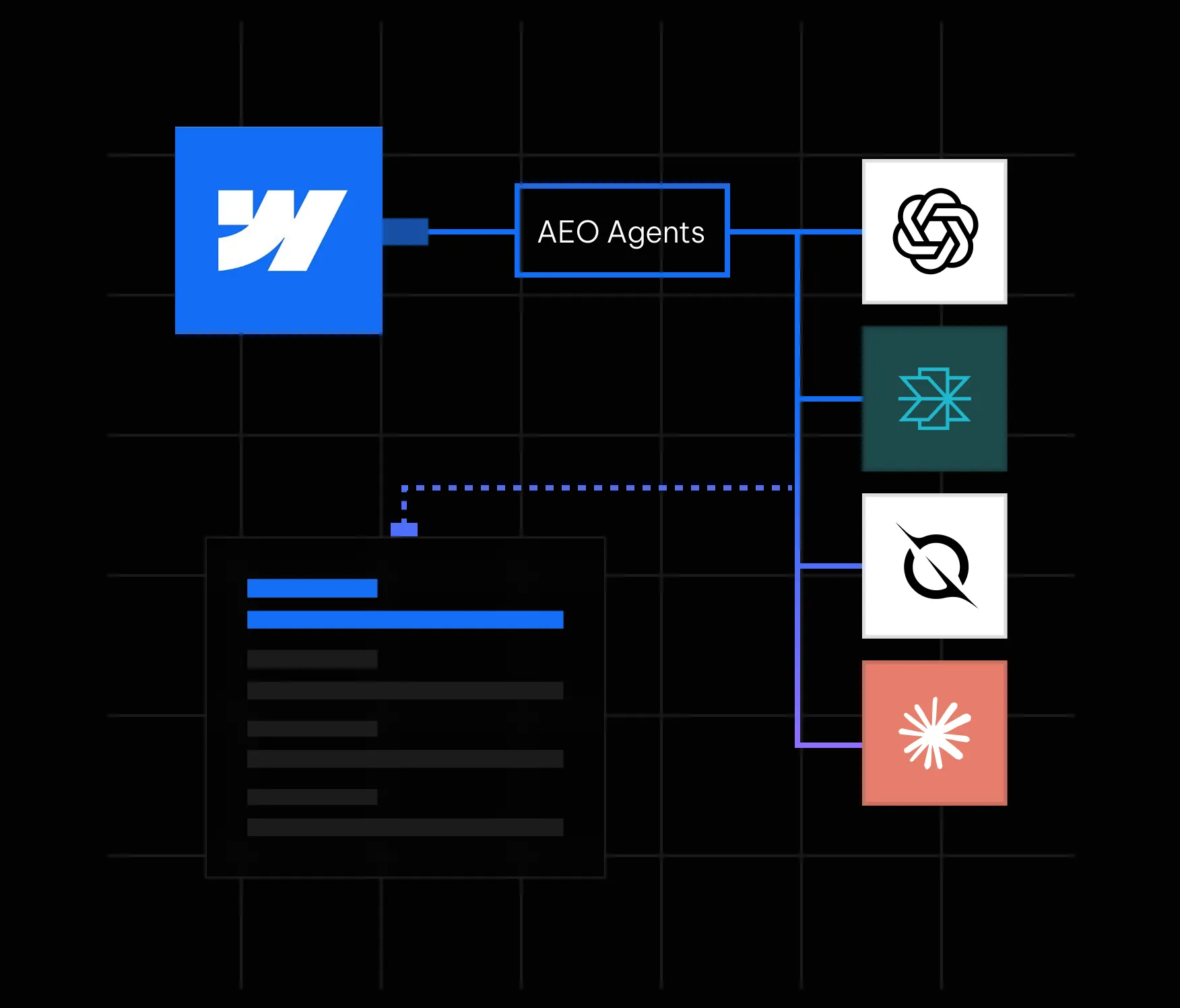
This is the reality that answer engine optimization (AEO) addresses. And in May 2026, Webflow made it significantly easier to act on by launching AEO agents natively inside its platform. If your site is on Webflow, you now have one of the most powerful AEO toolsets available built directly into the same interface where your site lives. In this guide, we walk through everything you need to know: what Webflow AEO agents actually do, how the closed-loop system works, how to get started, and what best practices will help you earn consistent citations in AI answers.
Answer engine optimization is the practice of making your website content easy for AI systems to find, understand, and cite. Where traditional SEO focuses on ranking on a results page, AEO focuses on being the source that an AI tool references when it constructs a direct answer for a user.
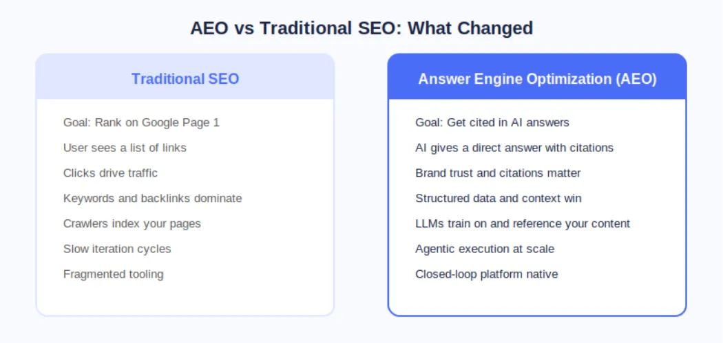
The distinction matters because AI answer engines operate fundamentally differently from search engines. A search engine crawls, indexes, and ranks pages. An AI answer engine does all of that, but it also synthesizes information and presents a curated response. The brands that show up are not necessarily the ones with the most backlinks; they are the ones whose content is structured, authoritative, technically clean, and contextually relevant to the question being asked.
According to Webflow's own research cited at launch, 93% of marketing leaders now consider AEO important for their brand. That number reflects a fundamental shift in how buyers discover and evaluate products and services before ever landing on a company website.
On May 21, 2026, Webflow made AEO agents generally available as part of its new Team and Enterprise Platform plans. This was a meaningful step beyond what most AEO tools offer because Webflow's agents do not just flag problems; they help you fix them at scale inside the same platform where your site is built and published.
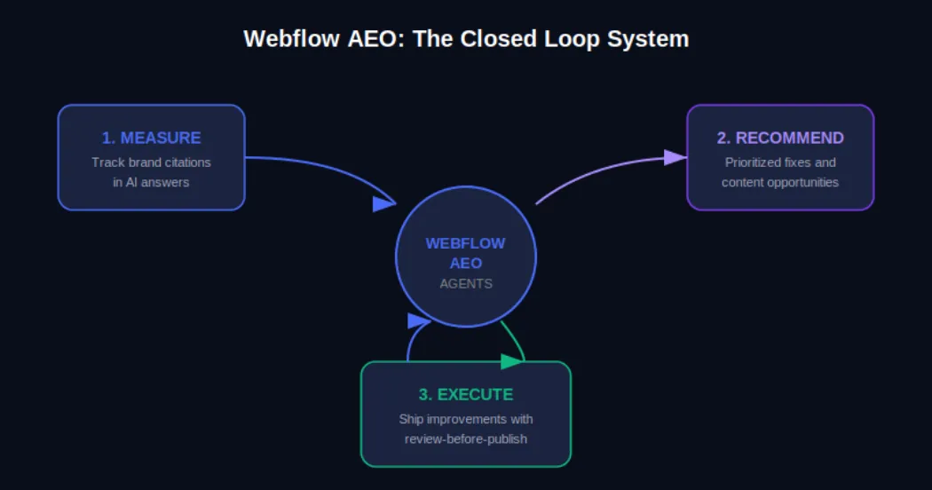
The Webflow AEO system operates around a closed loop with three distinct functions. First, it measures how your brand appears across AI answer engines. Second, it surfaces prioritized recommendations for improvement. Third, it helps your team execute those improvements and publish them directly from within Webflow, with a review step built in so nothing goes live without your approval.
AEO Analytics via Webflow Analyze: Teams can now track how often their brand is cited in AI answer engines, which prompts trigger those citations, and how AI-driven visibility connects to on-site engagement and conversions. No data instrumentation or separate analytics tool is required.
AEO Agents for Technical and Content Recommendations: The agents scan your Webflow site and surface a prioritized list of improvements, including broken links, outdated metadata, missing schema markup, and content gaps tied to the prompts you are actively tracking.
Review-Before-Publish Execution: Your team reviews each recommendation before anything changes on the live site. You can accept, edit, or dismiss suggestions individually or in bulk, and then publish directly from Webflow's centralized dashboard.
The Team plan bundles AEO agents alongside 10 seats, 100 CMS Collections, Localization, page branching, single-page publishing, publishing workflows, and 30TB of bandwidth. The Enterprise plan extends this further for larger organizations needing custom governance and dedicated support.
Webflow's own CPO Rachel Wolan described the launch this way: Webflow allows customers to work inside a system that already knows their brand, their voice, and what they are trying to say. The platform closes the loop between insight and shipped improvement automatically, so teams move from analysis to live changes without switching tools.
Understanding the mechanics of Webflow AEO agents helps you get more out of them from day one. Here is how the system moves from site scan to published improvement.
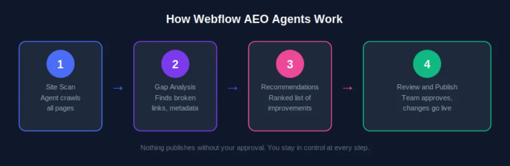
AEO agents require a Team or Enterprise Platform plan. Once you are on the correct plan, navigate to your Workspace settings and confirm that the Workspace AI toggle is enabled. This is the master switch that activates all Webflow AI features, including AEO agents. If you are managing multiple sites under one Workspace, enabling this once covers all sites under that plan.
Once AEO is activated, the agents perform an initial crawl of your site. This is not a surface-level check. The scan evaluates technical elements such as metadata completeness, schema markup presence, internal link health, and page structure, and it also assesses content-level signals like how clearly your pages answer specific question formats that AI systems are trained to respond to.
After the scan, you receive a ranked list of recommendations inside the Webflow dashboard. These are not generic suggestions. Because Webflow already holds your brand context, site structure, and content, the recommendations are specific to your pages and tied to the AI prompts you are tracking. A recommendation might be as straightforward as updating a meta description on a key service page, or as strategic as creating a new FAQ section for a product category that is generating AI-driven queries.
For each recommendation, your team has full control. You can accept it as-is, edit the suggested change before applying it, or dismiss it if it does not align with your brand voice or strategy. This step matters because AEO optimization is not purely mechanical; what reads well for an AI system also needs to read well for a human. Webflow's review step keeps your team in the editorial seat.
Once you have reviewed and approved changes, you can publish them individually or in bulk from the centralized view. For enterprise teams managing hundreds of pages, this bulk publishing capability is one of the most practically valuable aspects of the system. Work that previously required a developer or a week of manual edits can now be reviewed, approved, and live within a single session.
Executing AEO agent recommendations uses AI credits, which are now bundled with every Workspace plan from Core through Enterprise. Teams should monitor credit usage via the new AI usage dashboard, particularly after the credit enforcement window that began June 29, 2026. More details are available on the Webflow AEO overview page at Appsrow.
Measurement is where effective AEO strategy starts, and Webflow Analyze now provides the visibility data your team needs to understand where you stand in AI-generated search before you start optimizing.
From the Analyze dashboard, you can see which AI answer engines are sending traffic to your site, which prompts are triggering your brand citations, how citation frequency is changing over time, and how AI-driven traffic correlates with on-site engagement metrics like time on page and conversion events.
The practical value of this data is that it transforms AEO from a guessing game into an iterative improvement cycle. You can see what is working, identify gaps, feed those gaps back to your AEO agents as new prompt targets, and measure whether your changes produce the citation uplift you expected.
Webflow AEO agents handle the technical layer. The content layer is equally important, and it requires a deliberate writing strategy. AI systems do not just favor authoritative content; they favor content that is structured in a way that makes extraction and summarization easy.
Direct answer paragraphs: Lead each section with a clear, self-contained answer to the question the heading implies. If someone asks 'What is Webflow AEO?', your first paragraph should answer that in two to three sentences before elaborating.
FAQ sections: Structured question-and-answer formatting maps directly onto how AI systems construct responses. Every key landing page and blog post should have a FAQ section covering the most common queries in your topic area.
Listicles and how-to steps: Numbered steps and bulleted lists are among the most commonly extracted content formats in AI-generated answers. When describing processes, always default to structured list formats.
Expert opinion and proprietary data: AI systems increasingly favor sources that offer unique insight. Original research, survey data, case studies, and expert opinions are more likely to be cited than repackaged information that already exists at scale elsewhere.
Structured schema markup: FAQ schema, HowTo schema, Article schema, and Organization schema all help AI systems understand the structure and authority of your content. Webflow AEO agents will flag missing schema and suggest implementations, but having a proactive schema strategy speeds up your AEO results significantly.
For a deeper look at content strategy for AEO, see the Appsrow AEO content guide which covers format-specific tactics for B2B and B2C brands.
Content strategy matters, but AI systems will not reliably cite a site with significant technical issues. Webflow AEO agents surface technical problems as part of their initial scan, but understanding why these issues matter will help your team prioritize fixes intelligently.
Webflow's built-in AI SEO tools introduced at Webflow Conf 2025 already handle auto-generation of alt text, meta descriptions, and schema markup for many content types. Webflow AEO agents extend this by evaluating the output of those tools in the context of your current AEO performance and recommending targeted corrections. For a complete technical AEO checklist, explore the Appsrow technical AEO resources.
One of the less discussed but increasingly important aspects of AEO is entity recognition. AI systems do not just parse individual pages; they develop an understanding of what a brand is, what it does, who it serves, and what it is known for. The more consistently and clearly this information is represented across your site and across the web, the more likely AI systems are to treat your brand as a credible citation source.
Consistent brand descriptions: Every page that references your company should describe it in consistent terms. Your tagline, your core service description, and your value proposition should not vary significantly across your homepage, about page, and blog author bios.
Wikipedia and knowledge graph presence: For established brands, a Wikipedia page and Google Knowledge Graph listing are among the strongest authority signals for AI citation systems. If your brand does not yet have these, building toward them through press coverage and third-party mentions is a long-term AEO investment worth making.
Consistent NAP data: For local or regional businesses, Name, Address, and Phone consistency across directories, your Webflow site, and third-party citations builds the kind of entity coherence that AI systems use to verify brand legitimacy.
Author entity markup: If your team publishes content under named authors, adding Person schema and linking to author profiles with consistent credentials strengthens the E-E-A-T signals that AI systems use to evaluate content trustworthiness.
These brand signals take time to build, but the Webflow AEO agent recommendations will increasingly point you in this direction as your technical foundation strengthens. Track progress through the AEO analytics dashboard and measure citation growth month over month.
AEO agents are available on both the new Team and Enterprise Platform plans that Webflow launched in May 2026. Understanding what is included in each tier helps you plan the right investment for your team's scale.
The Team plan is Webflow's new mid-market offering designed for fast-growing teams that have outgrown self-serve plans but are not yet ready for a full Enterprise commitment. It is annual billing only and includes: AEO agents and AEO analytics, 10 seats, 100 CMS Collections, Localization, page branching, single-page publishing, publishing workflows, site activity log, custom SSL certificates, security headers, and 30TB of bandwidth. For teams managing a primary marketing site with a content team of five to ten contributors, the Team plan gives access to the full AEO agent system without requiring Enterprise-level negotiations.
Enterprise adds competitive AEO benchmarking, advanced governance controls, custom publishing workflows, dedicated support, and the ability to manage AEO across multiple sites at scale. For organizations with dozens or hundreds of pages across multiple properties, Enterprise is the tier where the closed-loop AEO system delivers its full value. Enterprise customers were also the first to access AEO in the initial rollout, meaning the system has been refined based on real-world usage at scale before broader availability.
To understand which plan makes sense for your team and how to structure your AEO deployment, the Appsrow Webflow consulting team offers a free AEO readiness assessment for brands considering the upgrade.
Do not try to optimize your entire site at once. Identify the five to ten pages that address the questions your ideal customers are most likely to ask AI tools, typically your homepage, key service or product pages, and your most trafficked blog posts. Run AEO agent recommendations on those first, implement the changes, and measure the citation impact before expanding to the full site.
Webflow AEO analytics tracks which prompts trigger your brand citations. Make sure you are actively tracking the prompts that matter most to your business, not just broad category keywords. For a B2B software company, the difference between tracking 'project management software' and 'best project management software for remote engineering teams' is the difference between vanity metrics and pipeline-relevant visibility.
AEO is not a one-time setup. AI systems update their training data and citation algorithms regularly. Plan a monthly review of your AEO analytics data, run a fresh agent scan, and process new recommendations. Teams that build this into their regular content operations cadence see compounding citation growth over time rather than a one-time spike followed by stagnation.
Every new piece of content you publish should be evaluated through an AEO lens before it goes live. Webflow AEO agents will catch technical issues after publication, but building AEO-friendly structure, FAQ sections, and schema markup into your content creation workflow reduces the remediation work significantly. For practical templates and workflows, see the Appsrow AEO content playbook.
Enterprise customers have access to competitive AEO benchmarking inside Webflow Analyze. Use this to identify specific prompts where competitors are earning citations that you are not. These gaps represent the highest-value content and technical optimization opportunities because they confirm there is an AI-generated audience for that topic and that your competitors are already capturing it.
Several standalone AEO tools have emerged alongside the shift toward AI-mediated search. Most operate as separate analytics dashboards that identify citation gaps and recommend content changes. What makes Webflow AEO different is the native closed loop.
Standalone tools typically require you to export their recommendations, translate them into actionable tasks, hand them off to a developer or content editor, wait for changes to be made in your CMS, and then re-import analytics to measure the result. Each of those handoffs is a friction point where execution slows down or breaks entirely.
Because Webflow AEO operates inside the platform that already holds your site, content, and brand context, the step from recommendation to published change is compressed into a single review-and-publish action. For teams that are already using Webflow, this is a structurally meaningful advantage over any external tool that requires platform switching.
Adobe LLM Optimizer, announced at Adobe Summit 2026, offers a comparable agentic approach for Adobe Experience Manager customers. For brands not on Webflow, that may be a relevant alternative. For Webflow users, the native integration makes the comparison straightforward. Explore more at appsrow.com/blog/webflow-aeo.
The May 2026 launch is a foundation, not a ceiling. Based on Webflow's stated platform roadmap and the direction of the AEO market, several developments are worth watching.
Stay current on Webflow AEO developments by following the Appsrow Webflow and AEO blog where we publish regular updates on Webflow platform changes and AEO strategy.
AI-generated answers are already shaping how buyers discover, evaluate, and choose brands. The question is not whether AEO matters for your business; that was settled when 93% of marketing leaders told Webflow it does. The question is whether your team has the tools and the execution speed to act on it.
Webflow's May 2026 launch of native AEO agents removes the most common obstacle: the gap between knowing what to fix and being able to fix it at scale. For Webflow users on Team or Enterprise plans, the closed-loop system is available now. The brands that start building their AEO presence today are the ones that will dominate AI-generated citations when those citations become the primary discovery channel for their category.
If you are ready to start showing up in AI answers, the first step is understanding where you stand today. The Appsrow AEO readiness guide gives you a clear picture of your current citation presence, your technical gaps, and the highest-impact actions to take with Webflow AEO agents.
There is a moment every marketer remembers: the first time they asked ChatGPT for a product recommendation and realised, with a jolt, that their brand was nowhere in the answer. No link. No mention. Just someone else getting the citation. If that moment has not happened to you yet, it will. Search is no longer just Google. It is a constellation of AI engines, answer systems, and generative interfaces that are collectively absorbing more than 65% of queries without ever sending a user to a website (Similarweb, 2025). For Webflow site owners, this is both a warning and an opportunity.
The opportunity is real. Webflow's own SEO team publicly reported that 8% of all new signups now come from AI search as of June 2025, up from just 2% in October 2024. A fourfold increase in eight months is not a rounding error. It is a channel shift, and the teams who respond earliest will capture territory that takes years for late movers to reclaim.
This guide is your complete roadmap for Generative Engine Optimization on Webflow. We cover the strategy, the technical architecture, the content frameworks, and the measurement systems. We also share how Appsrow, a Webflow Premium Partner with 300+ projects delivered, approaches GEO implementation for clients from early-stage SaaS startups to scaling enterprises. By the end, you will have a clear plan, not just a reading list.
Generative Engine Optimization (GEO) is the discipline of structuring your website, content, and digital presence so that AI systems, including ChatGPT, Perplexity, Google AI Overviews, Claude, and Microsoft Copilot, understand, trust, and cite your brand when answering relevant user queries.
Traditional SEO is fundamentally about signals to a ranking algorithm: keywords, backlinks, crawlability, page speed. GEO adds a different layer. AI systems do not rank pages in a list; they synthesise answers from multiple sources and credit the ones they trust most. Getting cited requires something closer to authority-building and source hygiene than classic on-page optimisation.
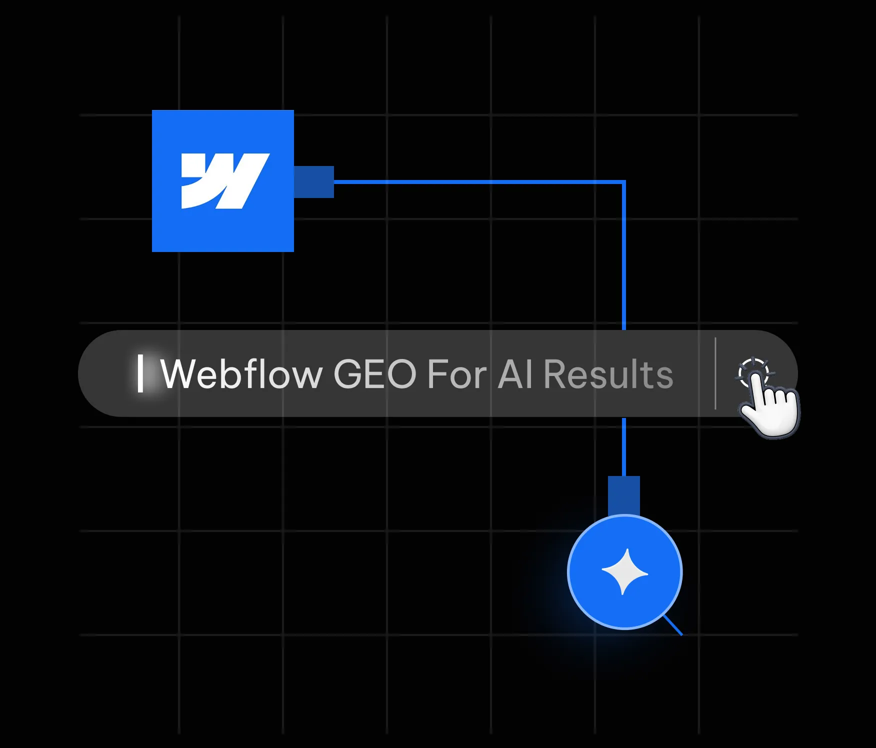
Webflow GEO specifically refers to the implementation of these principles inside Webflow's visual development environment, using its native features (semantic HTML output, CMS, custom code embed, schema markup tooling) in combination with content strategy and off-site authority signals.
The numbers from 2024 to 2026 tell a clear story. Here are the figures that matter most:
Perhaps the most telling data point comes from research by GEO firm Brandlight: the overlap between top Google links and AI-cited sources has dropped from 70% to below 20%. Ranking on Google no longer guarantees a seat at the AI table. These are two separate games now, and you need to play both.
Most platforms require you to fight their technical defaults before you can optimise for AI. Webflow does the opposite. Its architecture produces clean, semantic HTML by default, which is exactly what AI retrieval systems need to parse and trust your content. Here is why Webflow gives you a structural head start.
AI engines, like search engine crawlers, rely on HTML semantics to understand the hierarchy and meaning of your content. When you use headings correctly in Webflow (H1 for the page title, H2 for major sections, H3 for subsections), the platform writes valid HTML that LLMs can parse into a coherent knowledge structure. Unlike WordPress with its plugin conflicts, or page builders that wrap everything in nested divs, Webflow's output is honest markup.
This matters because LLMs are statistically 28 to 40% more likely to cite content with clear hierarchical structure (HubSpot GEO Statistics, 2026). A Webflow site built with discipline is already ahead of the majority of the web on this dimension.
In April 2026, Webflow launched a native schema markup tool with AI-generation capability, directly inside Page Settings. You can now generate contextually relevant JSON-LD structured data for any page with a single click, then refine it and bind it to CMS fields for dynamic collection pages. This makes schema implementation at scale dramatically more accessible than custom code-only approaches.
Webflow also launched its closed-loop AEO system in April 2026, which tracks brand citations across answer engines, surfaces prioritised optimisation recommendations, and lets teams ship those improvements directly in the platform. When a tool of this scale adds these capabilities, it signals that GEO has moved from experimental to foundational.
Webflow hosts on a global CDN with automatic asset compression, clean CSS output, and lazy loading. These are not cosmetic benefits. AI platforms prefer content that is 25.7% fresher than content cited in traditional search (Dataslayer, 2025), and they tend to favour fast, consistently available pages. Core Web Vitals are a proxy for trustworthiness, and Webflow sites routinely score in the top quartile out of the box.
For a deeper technical breakdown of how Webflow's architecture supports AI visibility, the Webflow University schema markup guide is an excellent reference alongside this article.
GEO is not a single tactic. It is a system. Each pillar below addresses a different layer of how AI systems discover, evaluate, and cite your site. Miss one, and the whole structure weakens. Master all seven, and you build a compounding advantage that most competitors will not replicate quickly.
The first and most important pillar is your content structure. AI engines scan for clarity: a clear question, a direct answer, supporting evidence, and a logical hierarchy. If your content is written the way a good consultant answers a question, you are most of the way there.
Specifically, this means:
One pattern that consistently outperforms is the question-and-answer paragraph structure. Write a bold question as a short subheading, then answer it in two to three sentences. Repeat. This is not only excellent for human readers; it maps directly to how retrieval-augmented generation (RAG) systems chunk and index your content.
Schema markup is the technical vocabulary AI systems use to extract machine-readable facts from your pages. A study cited by Digidop shows GPT-4's content extraction accuracy jumps from 16% to 54% when structured data is present. That is a staggering delta, and it represents one of the highest-ROI technical investments available to a Webflow site owner.
The schema types with the greatest impact on GEO are:
In Webflow, static schema goes in the custom code section of Page Settings. Dynamic schema for CMS collection pages requires binding schema properties to CMS fields, which Finsweet's Webflow SEO guide covers in detail. Always validate your implementation with Google's Rich Results Test before publishing.
Experience, Expertise, Authoritativeness, and Trustworthiness (E-E-A-T) is Google's framework, but it maps directly to what AI engines look for in a citable source. AI systems are trained to distinguish authoritative voices from generic content farms, and the signals are remarkably similar to what a careful human editor would look for.
Building E-E-A-T on a Webflow site means:
FAQs deserve their own pillar because they are disproportionately powerful in GEO. Generative engines are fundamentally question-answering machines. When your content is structured as well-formed questions and concise answers, and those questions match the phrasing real users type, the alignment between user intent and your content is nearly perfect.
Reddit saw a 450% increase in AI citations between March and June 2025, according to HubSpot's GEO statistics. The reason is structural: Reddit threads are already formatted as questions and answers. You can replicate this format intentionally in a far more authoritative context.
Best practices for FAQ architecture in Webflow GEO:
In 2024, a community standard emerged for helping AI systems understand which pages on your site are most relevant for training and retrieval: the llms.txt file. Placed at the root of your domain (e.g., yourdomain.com/llms.txt), it provides a structured index of your most important pages, written in plain language, along with brief descriptions of what each page covers.
Think of it as a sitemap, but written for language models rather than crawlers. The format is simple: a brief introduction to your brand, followed by a list of URLs and one-sentence descriptions of the content at each URL. It is optional, but as AI systems increasingly support it, early adoption signals that your site is prepared for machine understanding.
In Webflow, you can host an llms.txt file by creating a static page at /llms.txt using a Page Embed or by uploading it as an asset. For implementation guidance, AppsRow's AEO services page includes llms.txt setup as a core part of their technical GEO implementation framework.
Performance is trust. AI systems and their users share the same expectation: a page that loads slowly, shifts during load, or responds sluggishly to interaction signals unreliability. Core Web Vitals are measurable proxies for that trustworthiness, and they matter for GEO just as they do for traditional SEO.
For Webflow sites, the key technical GEO performance tasks are:
A technically clean Webflow build will outperform a WordPress site burdened with plugin overhead on most of these metrics without requiring ongoing intervention. This is one reason Webflow clients tend to see GEO gains faster after initial optimisation.
AI systems do not only read your website. They synthesise information from across the web to form a picture of who you are and whether you can be trusted. Your off-site presence is part of your GEO stack.
The channels that most reliably feed AI knowledge graphs include:
AppsRow is a Webflow Premium Partner and Webflow Global Leader based in Ahmedabad, India, with 8 years of digital expertise and more than 300 projects delivered across SaaS, AI, healthcare, manufacturing, and e-commerce. Their clients include early-stage funded startups and scaling enterprises across the US, UK, and Europe. The agency holds a 4.8-star client rating.
What distinguishes AppsRow's approach to GEO is that it is not theoretical. As a full-service team that combines design, development, and marketing under one roof, they build the technical foundations that AI discovery depends on from the ground up. GEO is not a retrofit; it is part of the architecture from day one.
1. AI-Ready Technical Foundation
Every AppsRow Webflow build includes clean semantic HTML structure, proper heading hierarchy, and performance optimisation as baseline deliverables. Schema markup implementation covering Organization, FAQPage, Article, and Service types is standard. They also implement llms.txt during launch, ensuring the site is immediately navigable by AI retrieval systems.
2. Answer-First Content Architecture
AppsRow works with clients to restructure existing content and build new content using answer-first frameworks. This includes rewriting key service pages as question-and-answer formats, building comprehensive FAQ sections with proper FAQPage schema, and mapping content to the natural language queries their target audience asks AI systems.
3. E-E-A-T Authority Signals
The agency creates and optimises author pages for every content contributor, ensures NAP consistency across all directory listings, and implements the Organisation and Person schema types to build a coherent entity graph. For clients seeking deeper authority, AppsRow coordinates guest publishing and directory presence as part of their retainer services.
4. Webflow AEO Integration
AppsRow was among the first agencies to implement Webflow's native AEO system, launched in April 2026. They use it to monitor brand citation rates across ChatGPT, Perplexity, and Google AI Overviews, surface prioritised improvement recommendations, and track AI referral traffic through Google Analytics 4. This closes the measurement loop that most GEO implementations lack.
5. Ongoing Optimisation and Reporting
GEO is not a one-time project. AI models update their retrieval patterns, new engines emerge, and content freshness signals evolve. AppsRow offers retainer support that includes quarterly content audits, schema validation, Core Web Vitals monitoring, and AI citation tracking. For clients who want to go deeper, explore Appsrow's complete Webflow development services and their dedicated AEO and GEO optimisation offering.
'Our perspective on AEO is not theoretical. We build the technical foundations that AI discovery depends on: answer-first content architecture, structured data and schema implementation, llms.txt setup, clean and fast Webflow builds, and the kind of consistent entity and authority signals that help brands get cited.' That is how AppsRow describes their approach on their website, and it matches what their client outcomes consistently reflect.
Traditional SEO has Google Search Console. GEO does not yet have an equivalent single-pane dashboard, but the measurement landscape is maturing quickly. Here is how to track what matters.
Set up a custom channel group in GA4 to capture traffic from AI sources. The referral domains to track include: chat.openai.com, perplexity.ai, gemini.google.com, claude.ai, bing.com (which includes Copilot traffic), and you.com. Create a segment for these sources and monitor monthly sessions, conversion rate, and revenue contribution.
AI-sourced traffic currently converts at approximately 1.2 times the rate of organic search (WebFX, 2026). Users arrive with more context, more intent, and further through the decision process. Even a small volume of AI referral visits can have outsized revenue impact.
Once a month, test 10 to 15 queries that your ideal customer would realistically ask ChatGPT, Perplexity, and Google AI Overviews. Queries like 'best Webflow agencies for SaaS', 'how to optimise a Webflow site for AI search', or 'which agency should I use for Webflow AEO'. Record whether your brand appears, in what context, and with what framing. This qualitative audit complements the quantitative referral traffic data.
Use Google's Rich Results Test and Schema.org validator monthly to confirm your structured data is parsing correctly. A schema error can silently kill your AI citation potential without showing up in traffic reports until it is too late.
AI platforms prefer content that is demonstrably up to date. Set a quarterly calendar reminder to review your most important pages: update statistics to current figures, add new case studies, and refresh FAQ answers to reflect current best practices. Every update is a signal of active maintenance.
Webflow makes it easy to create stunning visual designs. It also makes it easy to use text elements styled to look like headings without actually being heading tags. If your H1 is a styled div and your visual hierarchy has nothing to do with your HTML hierarchy, AI engines see noise, not structure. Fix: audit your HTML output in browser DevTools and ensure your heading tags match your intended content hierarchy.
Schema that is added once and never validated becomes a liability. Webflow updates, CMS changes, and new page types can all break structured data without obvious visible symptoms. Fix: add schema validation to your quarterly content audit process.
GEO rewards content that answers questions the way a knowledgeable human would in conversation. Keyword-stuffed content that reads as if it was written for a 2015 search algorithm will not be cited by AI systems that have access to the entire web. Fix: rewrite your top 10 pages using the answer-first framework described in Pillar 1.
A Webflow site with perfect on-page GEO but no consistent off-site presence is a one-legged stool. AI systems triangulate authority across multiple sources. If your LinkedIn, Clutch profile, and Google Business Profile all say something different about your company, the AI cannot build a reliable entity entry. Fix: audit your brand presence across all major platforms and align your name, description, and category data.
Most teams discover their AI referral traffic is significant only after they have been ignoring it for six months. By that point, they have no baseline to measure improvement against. Fix: set up your GA4 AI channel group today, even before you begin any GEO optimisation. Data from the starting state is invaluable for demonstrating ROI later.
The search landscape of 2026 is not the landscape of 2023. The brands that appear in AI answers were not chosen randomly. They built authority, structured their content for machines as well as humans, implemented schema markup before it was fashionable, and published original research that gave AI systems something genuinely worth citing.
Webflow is an exceptional platform for this transition. Its clean output, native schema tools, performance infrastructure, and new AEO system give you a technical foundation that most platforms cannot match without significant custom engineering. The platform advantage is real. But it is only an advantage if you act on it.
The seven pillars covered in this guide, semantic content architecture, schema markup, E-E-A-T signals, FAQ architecture, llms.txt, Core Web Vitals, and multi-platform authority, are not a checklist to complete once. They are an ongoing practice. The teams that treat GEO as a compounding long-term investment will look back in two years and see a moat that took half a decade for competitors to cross.
If you are ready to implement Webflow GEO with expert support, Appsrow has delivered GEO-ready Webflow builds for 300+ clients across SaaS, AI, healthcare, and e-commerce. Their full-service team covers design, development, content architecture, and ongoing optimisation. Explore their Webflow AEO services or read their complete AEO guide to see the full scope of what is possible.
From brand identity to Webflow development and marketing, we handle it all. Trusted by 300+ global startups and teams.


