


.png)
Webflow
May 6, 2026

Transform your website with expert Webflow development
From brand identity to Webflow development and marketing, we handle it all. Trusted by 50+ global startups and teams.
There's a certain kind of product update that doesn't make headlines, but makes your day a little better every time you open a browser. Webflow's latest favicon update is exactly that.
Launched on May 5, 2026, the update brings two meaningful changes to how favicons work inside Webflow - auto-resizing and dark mode support. Let's break down what actually changed and why it matters.
If you've managed Webflow sites for a while, you know the drill. You'd get a logo file from a client, open a favicon generator tool, download a zip, sort through the sizes, figure out which one goes where, upload it, and pray it looked okay in the browser tab.
Multiply that by a dozen client sites and it's the kind of low-grade friction that eats up time without anyone noticing - until you're knee-deep in 192×192 PNG files at 11pm.
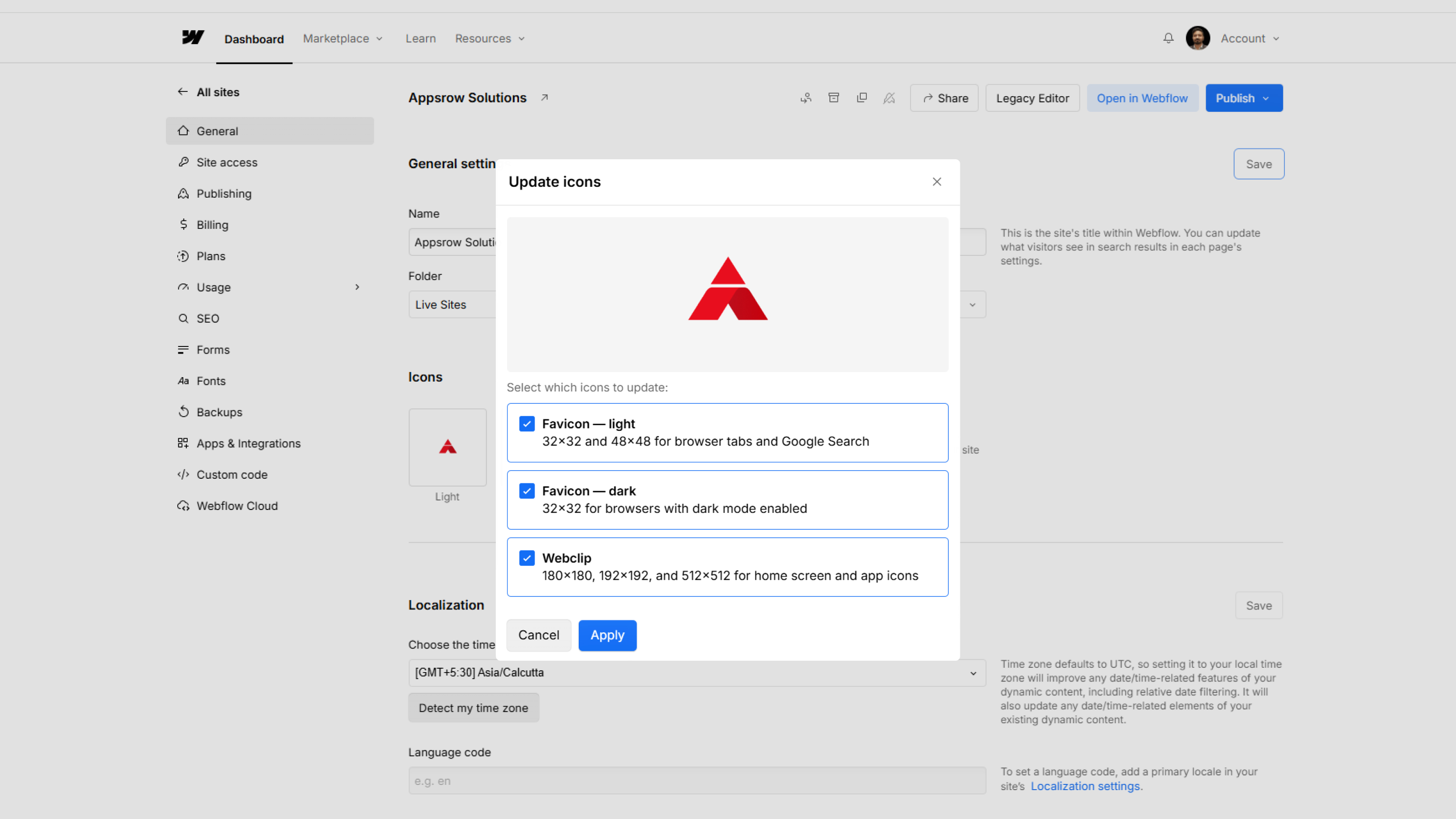
One Upload. Every Size. Done.
The new behavior is refreshingly simple. You upload a single square image inside Site Settings, and Webflow automatically generates every size the site needs:
Accepted formats include PNG, JPG, GIF, ICO, and SVG. If you upload an SVG, Webflow converts it to PNG automatically to keep things compatible across browsers.
No plugins. No external tools. No more favicon-generator.org tabs open at midnight.
This is the part I think will matter most to designers who care about brand details.
Here's the problem: a lot of logos are designed with a white or light-colored icon. On a light browser tab, that's fine. But switch to dark mode - which a huge portion of users now prefer - and your favicon either vanishes or looks muddy against the dark chrome.
Webflow now lets you upload a second favicon specifically for dark mode. The platform uses the browser's prefers-color-scheme media query to detect which theme the visitor is using and serve the right version. So your light logo gets shown to light mode users, and your dark-mode-optimized icon shows up for everyone else.
The dark mode favicon option appears in Site Settings once you've uploaded your primary (light theme) favicon. It's optional - but for anyone serious about brand consistency across different environments, it's worth spending five minutes on.
Google uses a 48×48 favicon when displaying search results. That little icon next to your URL in the search listing is part of how users visually identify your site - especially when they're scanning through multiple results.
Previously, you had to make sure you'd specifically uploaded the right size for this to render correctly. Now, Webflow generates the 48×48 size automatically as part of the new favicon pipeline. No extra steps.
It's a small thing, but brand presence in search results adds up over time.
Head into your Webflow project → Site Settings → Favicon & Webclip. Upload your image, and if you want dark mode support, the option will appear below once your primary favicon is set.
Full documentation is available on the Webflow Help Center if you want to dig into the specifics.
Webflow continues to ship these small-but-meaningful workflow improvements alongside bigger platform features - and honestly, these are often the updates that save the most real-world time.
.png)
May 6, 2026


